Windows 11 will soon let you pick how much unified memory is reserved for graphics and AI. The feature is hidden in a recent Windows Insider build (29648) and was discovered by X user @XenoPanther.
Unified memory is high-bandwidth memory that can be shared between a CPU, GPU, and other processors. Traditionally, PCs with discrete graphics cards have dedicated VRAM (video memory) that lives separately from other memory.
Unified memory is still relatively new to PCs. The upcoming NVIDIA RTX Spark lets you use up to 128GB of unified RAM. AMD's Ryzen AI Max already features unified RAM.
Apple popularized the concept of unified memory with its M-Series chips, though the technology is not exclusive to Apple.
If the unified memory feature in testing rolls out, Windows 11 will have a key differentiator from macOS.
Here is how the Unified Memory settings will appear (Under System > Advanced) https://t.co/eN8Gs0BYKs pic.twitter.com/2OpiBrWspZAugust 21, 2026
Microsoft's new feature lets Windows 11 users "reserve additional unified memory for graphics and AI intensive games and applications." The setting would help ensure smooth performance for certain types of workloads that require a lot of memory.
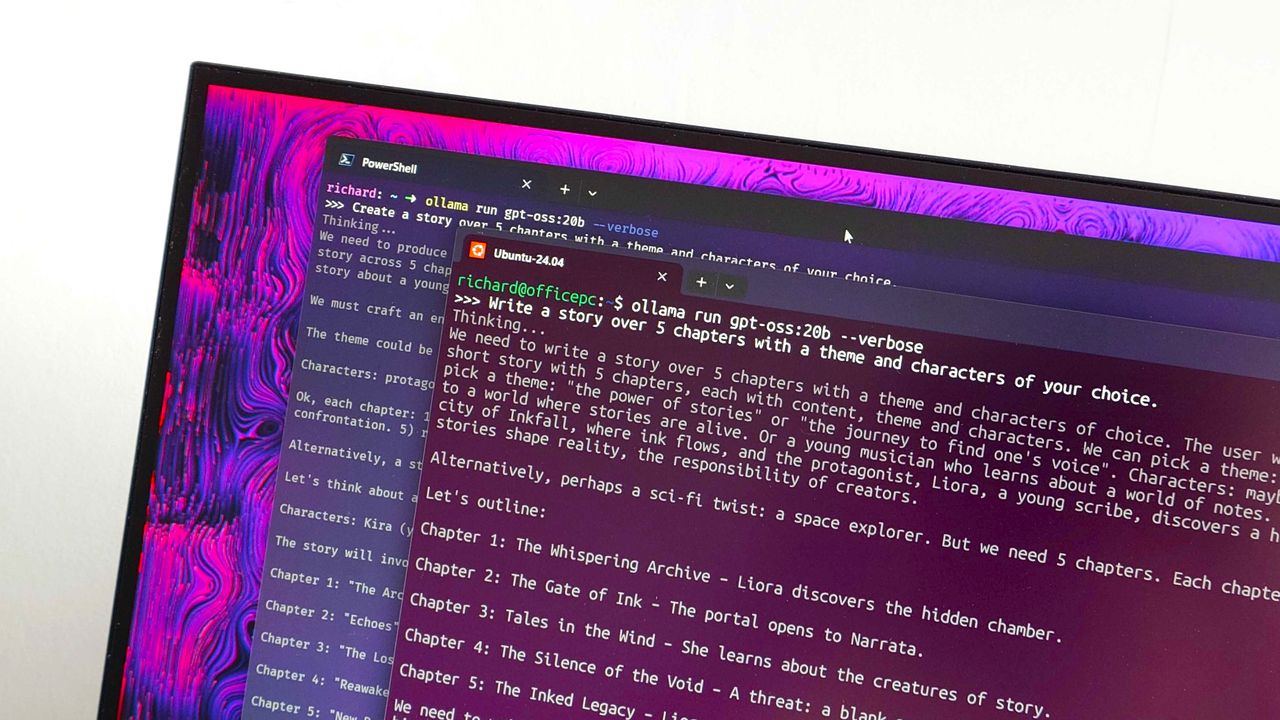
Normally, Windows manages shared memory dynamically, shifting resources back and forth as apps demand them. That approach works fine for general multitasking, but it runs into problems with heavy workloads like local AI inference or 3D gaming.
When memory is shared like that, background OS tasks and apps can contend for the same pool of RAM. That competition can cause latency spikes, frame drops, or total out-of-memory crashes when you're trying to run something demanding.
By letting users reserve memory, workloads with high demands for graphics and AI have uninterrupted access to high-speed memory.
The feature is not finished and has not been announced by Microsoft, so it requires some extra work to see. You can force it to appear using ViveTool.
I'd recommend waiting until the feature enters testing or even ships to general users before using it. In most cases, it's worth letting Microsoft work out any issues and polish the experience rather than use a hidden feature.
Join us on Reddit at r/WindowsCentral to share your insights and discuss our latest news, reviews, and more.
In this week's episode of the Windows Central Podcast, Daniel Rubino and Zac Bowden break down the latest Windows 11 insider features, focusing heavily on major overhauls coming to context menus, File Explorer polish, and options to force apps to open full-screen. They also dive into a surprising new Signal 65 processor study highlighting how Qualcomm's Snapdragon X2 chips stack up against Intel and AMD, wrap up recent Windows 11 improvements from March onward, and touch on various tech ecosystem shifts.
This episode of the Windows Central Podcast is sponsored by Surfshark VPN. Unlimited devices, access your content from anywhere, and auto-block malware on Windows, Edge, and other platforms from $2.50/mo, with 3 months extra FREE. Sign up today!
00:00 — Introduction & Welcome: Daniel Rubino and Zach Bowden kick off Episode 402 of the Windows Central Podcast.
03:45 — Qualcomm Snapdragon X2 vs. Intel & AMD: Analyzing the Signal 65 processor study results, showing how Qualcomm beats out Intel and AMD chips in recent laptop testing.
10:15 — Windows 11 Context Menu Overhaul: Breaking down new customizable, faster context menus in Windows 11 Insider builds, including default cleanups and third-party app management.
24:30 — File Explorer Improvements: Reviewing massive performance updates, elimination of freezing/hang delays, and better UI polish for File Explorer.
42:10 — Forcing Apps to Open Full-Screen: Discussing the new Windows settings toggle that allows users to automatically launch apps in full-screen mode.
52:00 — Recap of Windows 11 K2 Features & General State of the OS: A look back at the overall quality-of-life improvements rolled out to Windows 11 since March.
1:05:15 — Wrap-Up & Outro: Final thoughts, social media handles, and sign-offs until next week's episode.
Have a question you want us to answer on the podcast? Send it to us at [email protected]
Microsoft continues to improve Windows 11. Just this past week, the company began testing new context menus with Windows Insiders and revamped the ancient AutoPlay dialog box.
The Windows K2 initiative to improve the operating system is going so well that I've asked if the next big update should be Windows 12. But fixing the Windows experience is about more than context menus and a unified user interface. Even if Windows is fixed, Microsoft needs to make better apps.
If a person logs onto a PC running a beautiful and zippy version of Windows 11, they won't care about the OS if Microsoft Teams takes too long to load. Microsoft needs to lead by example by making the best Windows apps.
Biggest News of the Week
To give Microsoft credit, work is being done to improve some apps. Rudy Huyn, a well-known Windows developer who worked on the Microsoft Store, is putting a team together to improve Windows apps. That team is still in its infancy, so we will have to wait to see the results.
But Microsoft's app issue isn't just about having a team dedicated to in-box apps or hiring good developers. It's about the direction Microsoft pushes those developers. Microsoft Teams and other Microsoft apps have been "rebuilt from the ground up" or "refreshed with performance in mind" several times over the years. But the underlying problem still exists. Microsoft made the wrong choice by going all-in on web apps, and it needs to course correct.
Huyn's team is all about native apps, but it's not clear right now how many apps will fall under its umbrella. Will we see a new native version of Outlook? What about Microsoft Teams? If Huyn's team is just focused on in-box apps, some of the most-used apps on Windows 11 will remain laggy web apps.
Plus, several of Microsoft's biggest apps aren't even in the same part of the company as Huyn's team. If Microsoft fixes the Photos app, OneDrive, and other in-box apps, but Teams is still laggy, Microsoft is still delivering a poor user experience.
Shopping with Sean
Speaking of apps, this week's top deal is on the ever-popular Microsoft 365. That software suite is massively discounted right now if you bundle it with NordVPN. You'll get the best value if you use both Microsoft 365 and NordVPN, but the bundle is more affordable than Microsoft 365 on its own.
This bundle is the most affordable way to get a year of Microsoft 365. As an added bonus, it comes with a year of NordVPN Basic, which is a $49.99 value on its own.View Deal
Microsoft 365 Family provides access to the software suite for up to six people. Each of those users will have their own copy of apps like Word, PowerPoint, and Excel plus 1TB of OneDrive storage. This bundle also includes a free year of NordVPN Basic.View Deal
Join us on Reddit at r/WindowsCentral to share your insights and discuss our latest news, reviews, and more.
As part of the September 2026 update, Microsoft is giving users more control over some of Windows 11's most visible features. The update introduces several customization options that let you change how the desktop works and make some of the default experiences less intrusive.
Once you install the update on your computer, you'll be able to move the Taskbar to the top of the screen, adjust the size of the Start menu, and disable web results from Windows Search. The options are part of Microsoft's ongoing Windows K2 work to make the desktop more customizable, and they're available through the Settings app.
In this how-to guide, I'll show you the easy steps to customize your desktop with features that are coming back to Windows 11.
Important: Starting with the September update, Microsoft is expected to begin gradually rolling out these features, meaning not every device will get them right away.
1. Place the Taskbar at the top of the screen
Starting with this release, the company begins a gradual rollout of changes that let you change the position and size of the Taskbar.
To change the Taskbar position, use these steps:
Open Settings.
Click on Personalization.
Click the Taskbar page on the right side.
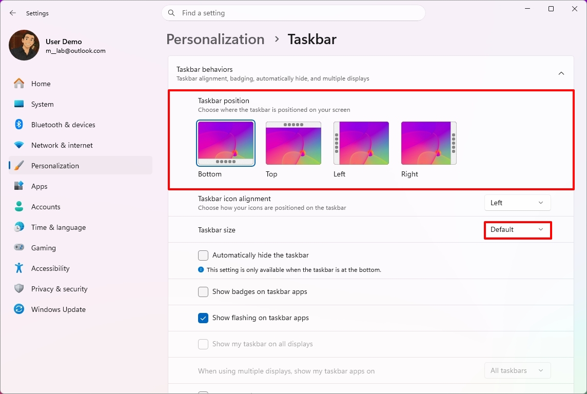
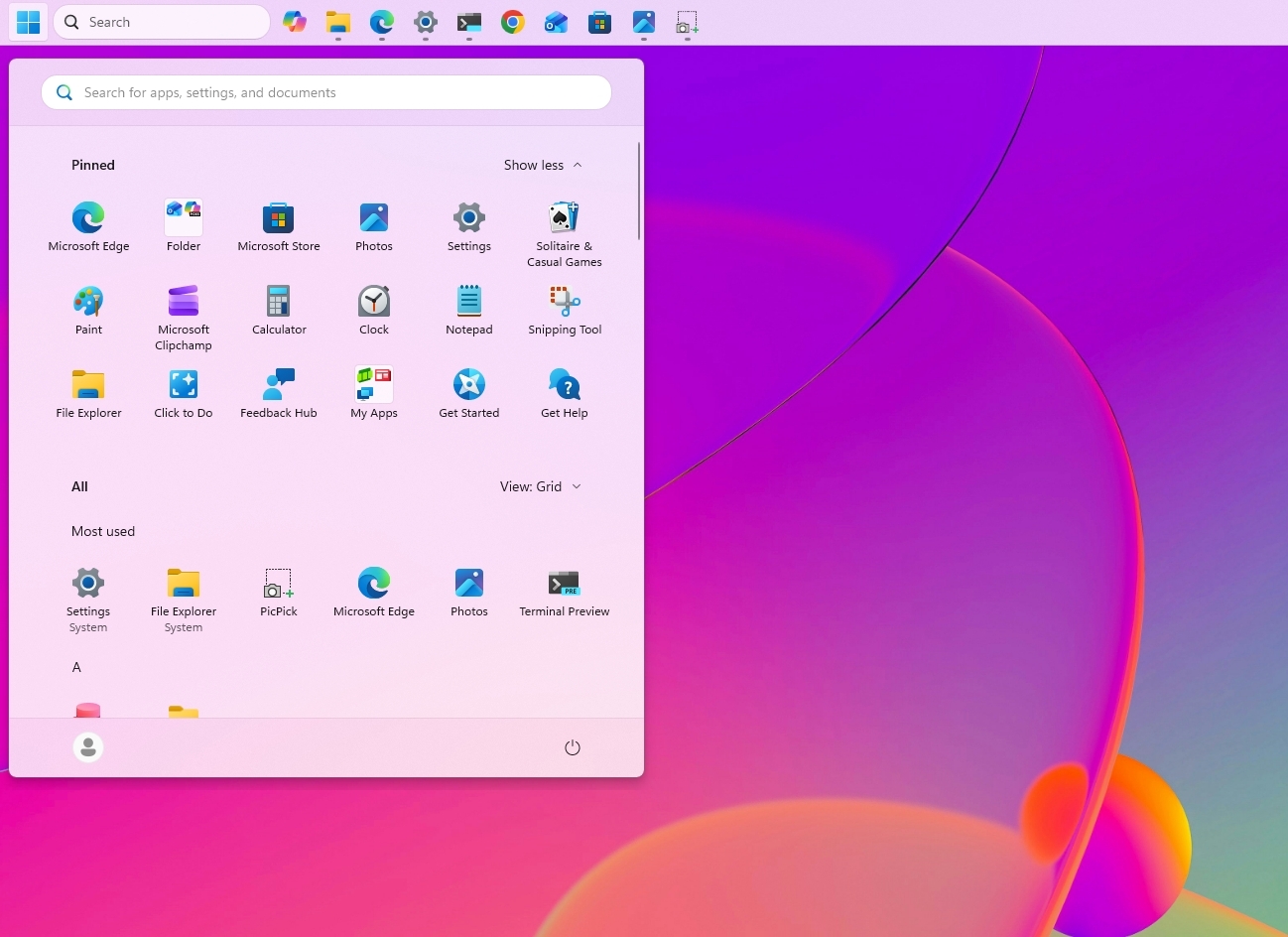
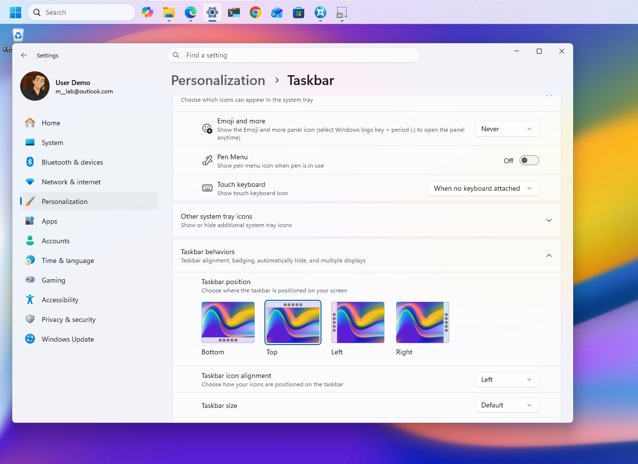
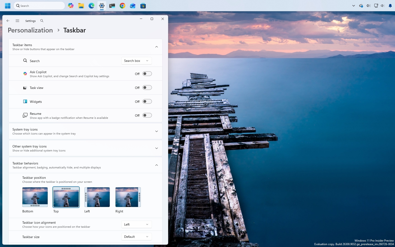
Select the Taskbar position (including Bottom, Top, Left, and Right) under the new "Taskbar position" setting.
(Image credit: Mauro Huculak)
(Optional) Choose the Small option in the "Taskbar size" option to make the Taskbar and icons smaller and free up screen space on your desktop.
Once you complete the steps, the Taskbar will apply your current configuration, and flyouts, tooltips, and animations will continue to appear as expected based on the position.
(Image credit: Mauro Huculak)
However, I've noticed that docking the Taskbar on the left side also slides the Notification Center to the left, which many people find not ideal.
2. Change the Start menu size
Microsoft also lets users further customize the Start menu. As part of the new changes, you can finally change the Start menu sides, decide what sections appear in the menu, and hide your profile name and picture from the experience.
To resize the Start menu on Windows 11, use these steps:
Open Settings.
Click on Personalization.
Click the Start page on the right side.
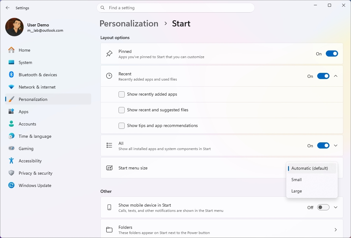
Turn off the toggle switches for the sections you don't want to see in the Start menu.
(Optional) Choose whether the Recent section (formerly Recommended) shows recently added apps, recent and suggested files, and tips and app recommendations.
Quick tip: The "Show recent and suggested files" option works independently from the File Explorer file history.
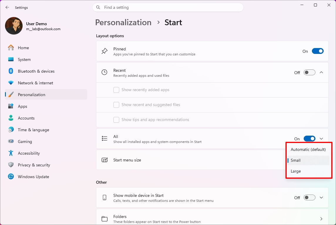
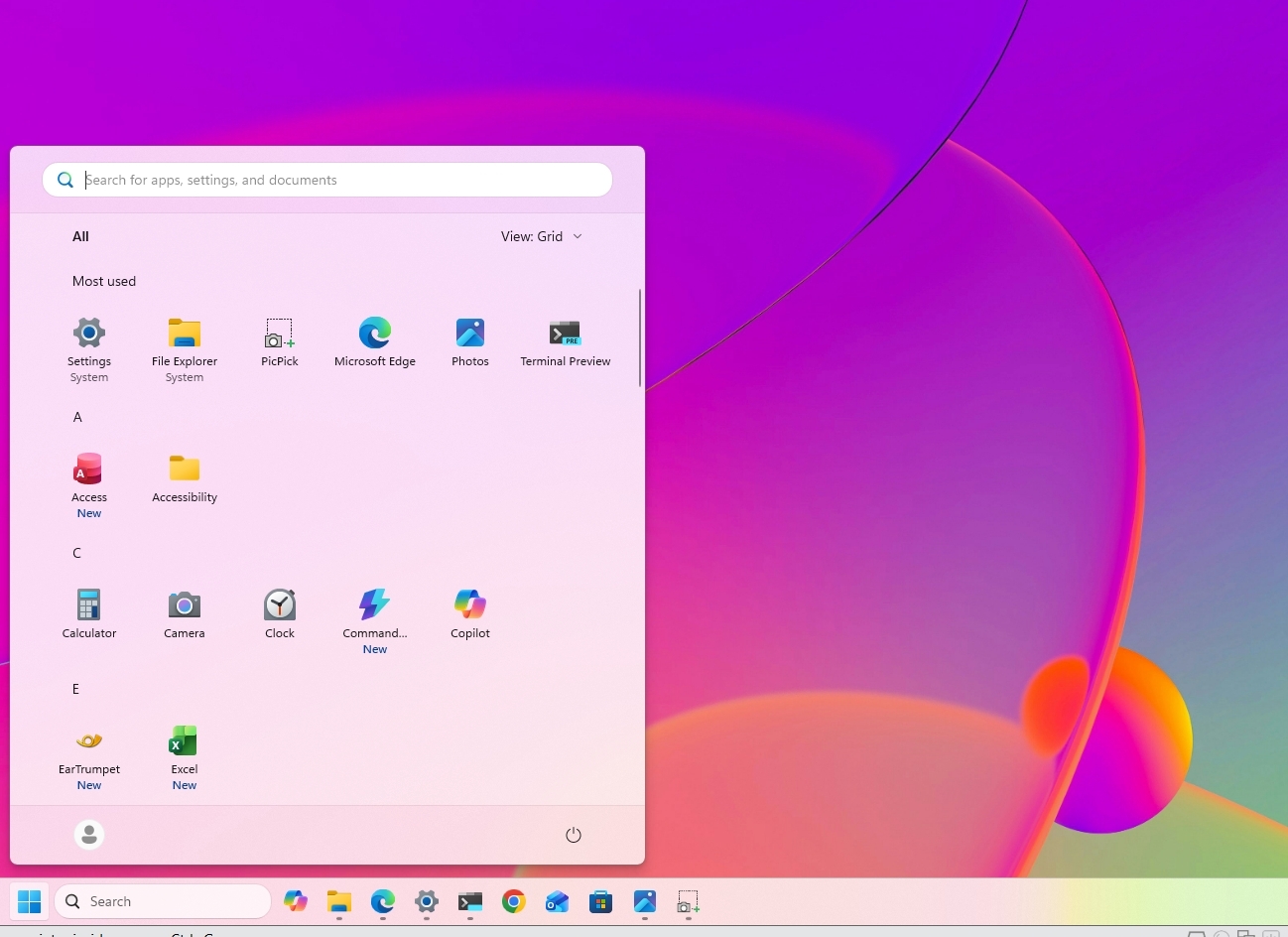
Choose the Small or Large option in the "Start menu size" setting to change the menu size.
(Image credit: Mauro Huculak)
(Optional) Turn on the "Hide your name and profile picture on Start" toggle switch.
After you complete the steps, the new customization settings will apply to the Start menu for a more personalized experience.
(Image credit: Mauro Huculak)
3. Disable web results from Windows Search
Finally, Microsoft is also improving the Windows Search experience with several interface tweaks and, more importantly, with the ability to disable web results as well as Microsoft Store app suggestions.
To disable web results from Windows Search, use these steps:
Open Settings.
Click on Privacy & security.
Click the Search page on the right side.
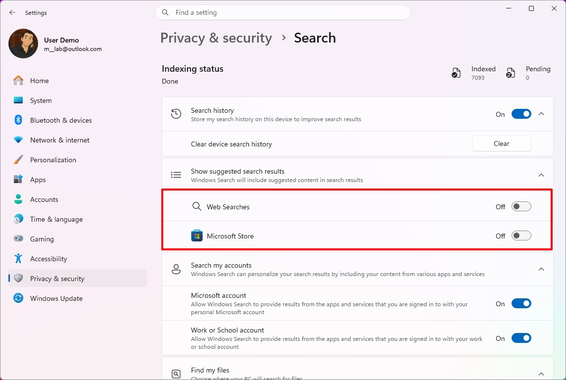
Turn off the Web Searches toggle switch to prevent Bing results from appearing in searches under the "Show suggested search results" setting.
(Image credit: Mauro Huculak)
Turn off the Microsoft Store toggle switch to prevent app suggestions from the Store when performing a search.
Once you complete the steps, when performing a search, the results will focus on files, settings, and apps.
(Image credit: Future)
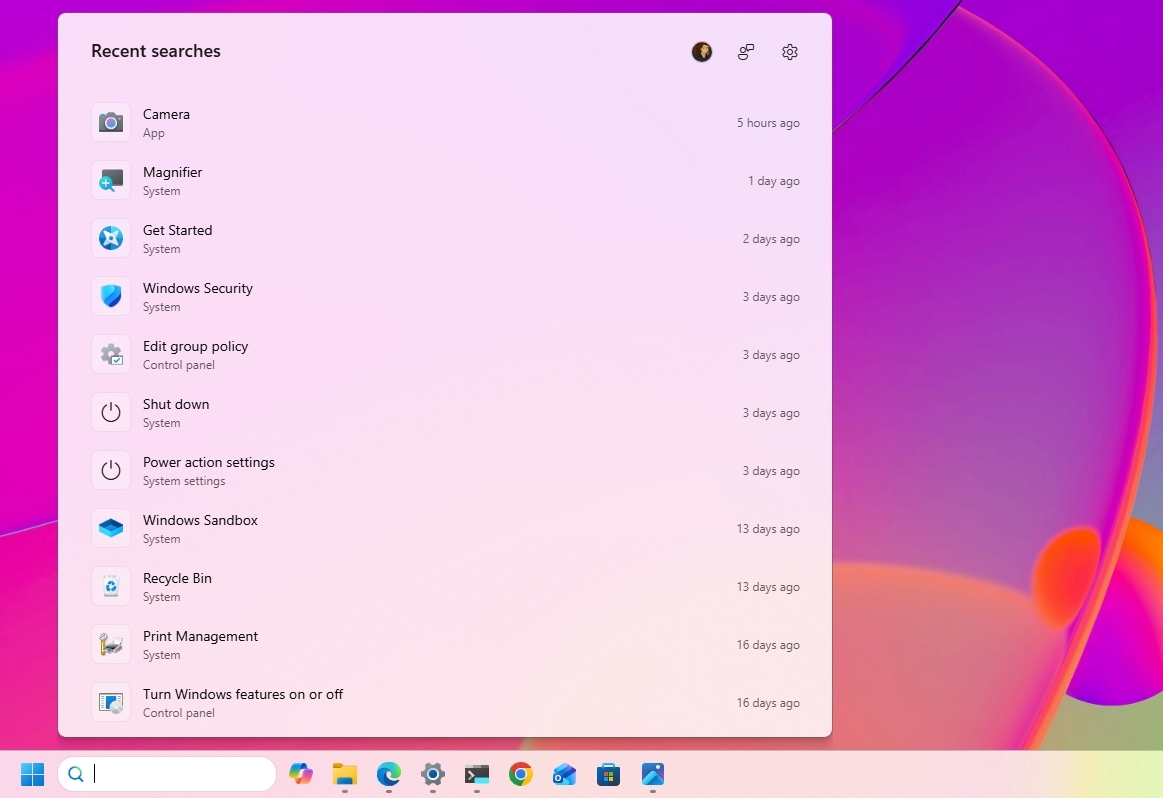
Windows Search also gets several usability improvements with the September update. The Search home experience is being simplified to reduce clutter and make recent searches easier to access.
Also, search results will make it clearer whether an item is an app, setting, file, web result, or Microsoft Store suggestion.
Finally, the operating system will additionally be able to automatically index frequently used folders, helping files from those locations appear more quickly in future searches.
Windows Central's Take
I like this update because it addresses a few of the areas where Windows 11 has felt unnecessarily restrictive since its original release. Being able to move the Taskbar, change the Start menu size, and finally remove web and Store suggestions from Search gives me more control over how I actually use the desktop instead of being forced into specific defaults.
The Taskbar change is probably the biggest deal for long-time users. I still think the ability to move it should have been there from the beginning, but bringing back that flexibility is better than continuing to defend the original Windows 11 design decision. The same goes for Search. If I'm looking for a file, app, or setting, I don't always want Bing or Store suggestions mixed into those results.
I wouldn't call these revolutionary changes, but that's exactly why I think they are important. A lot of people use the operating system differently, and these small controls can make the experience feel much more personal. I recommend changing them to fit your workflow. Microsoft is rolling them out gradually, so they may not appear immediately after installing the update.
What are your thoughts about these new customization options on Windows 11? Let me know in the comments.
More resources
Explore more in-depth how-to guides, troubleshooting advice, and essential tips to get the most out of Windows 11 and 10. Start browsing here:
Windows 11 is finally starting to look less like the operating system Microsoft wanted everyone to use, and more like the experience users have been asking for.
It might sound like an overstatement, but look at what the company has been changing lately.
Microsoft is giving users more control over the context menu. It's bringing back the ability to move and resize the Taskbar. It's giving users more control over the Start menu. And across the experience, the company continues to modernize legacy tools without stripping away the functionality that made them useful in the first place.
These changes are part of the company's Windows K2 initiative, which is focused on improving Windows 11's performance, reliability, responsiveness, and overall experience. However, there's another theme running through some of these changes that deserves more attention.
Microsoft is giving users back some of the control it took away when it launched Windows 11. And frankly, it's about time.
Windows 11's biggest problem was never the new design
When Windows 11 first became available, Microsoft wanted the desktop to feel simpler, cleaner, and more approachable. That meant redesigning major parts of the shell, simplifying menus, and reducing what the company considered "unnecessary" complexity.
The problem wasn't that Windows 11 looked different. The problem was that Microsoft sometimes confused simplification with removing choices.
(Image credit: Mauro Huculak)
The redesigned context menu is probably the best example. Microsoft created a simpler menu that left out many existing commands, forcing users to open the classic menu to access them. However, over time, the modern menu started becoming cluttered again as more commands and app integrations were added, weakening the simplicity that was one of the reasons for the redesign in the first place.
(Image credit: Mauro Huculak)
The Taskbar lost several customization options. Users could no longer move it to the top or sides of the screen. The Start menu became more rigid. A lot of familiar pieces of the operating system were redesigned around the company's preferred workflow rather than the different ways people had used the desktop for years.
Microsoft's intentions were understandable, but the results weren't always convincing. For an operating system built around flexibility, Windows 11 sometimes felt surprisingly restrictive.
Now Microsoft is giving users more control again
That's why the latest context menu changes are more interesting than they initially appear. Microsoft isn't simply making the context menu faster and easier to use. It's giving users more control over how it works.
Users will be able to customize which actions appear, manage entries from apps separately, and control how certain commands show up in the experience. The development team is also working on an option to restore a more traditional vertical arrangement for primary actions, such as Cut, Paste, and Delete.
(Image credit: Mauro Huculak)
That's a significant change in how Microsoft is approaching the design of Windows 11. Instead of deciding exactly how everyone should use the context menu, the company is giving users more control over the experience.
We've seen similar changes across the operating system. Microsoft is bringing back Taskbar positioning and sizing options. The company continues to rethink the Start menu. It's also modernizing older components without necessarily throwing away the functionality users depend on.
(Image credit: Mauro Huculak)
The context menu isn't the only example, since the company is also giving users more control in other parts of the experience.
Microsoft is learning users don't all use the OS the same way
This is where I think the software giant got Windows 11 wrong. There is no single correct way to use the operating system.
For instance, some people want a clean desktop with as little clutter as possible. Others want every option available at their fingertips.
Some people want the Taskbar at the bottom. Others prefer it at the top or along the side.
(Image credit: Mauro Huculak)
Some users rarely use the context menu. Power users can depend on it dozens or even hundreds of times a day.
The operating system has always been able to accommodate those differences. That's one of the reasons the platform became so successful.
Microsoft doesn't need to force everyone into the same workflow to make the desktop easier to use. It can provide reasonable defaults while still letting people change the experience when they want to.
Microsoft shouldn't get too much credit for restoring what it removed
There is an important caveat here. I like where Windows 11 is heading, but Microsoft shouldn't get a free pass simply because it's restoring functionality that didn't necessarily need to disappear in the first place.
The Taskbar didn't need to lose its positioning options, and the context menu didn't need to become so restrictive. And that makes the current changes somewhat frustrating.
The company spent years moving Windows 11 toward a more controlled experience. Now, several years into the operating system's life, it's gradually bringing some of that flexibility back.
I'd rather Microsoft learn from this and not make the same mistake again.
Windows 11 doesn't need fewer choices
I don't think the company needs to turn Windows 11 into Windows 10 again. Windows 11 should look like Windows 11.
It should have its modern interface, new architecture, and new capabilities. Microsoft should keep improving the entire experience and continue modernizing older parts of the operating system.
However, modernization shouldn't mean reducing functionality. A modern component should ideally be better than the old one without being less capable. That's the standard Microsoft should stick to, and the context menu is a surprisingly good example.
If the company can give Windows 11 a cleaner, more modern context menu while also letting users decide which commands they want and how they want to access them, that's a much better solution than forcing everyone into the same interface.
The same principle should apply throughout Windows 11. The operating system should be easy to use by default while still giving users the flexibility to make it work the way they want.
Windows Central's Take
The most interesting thing happening to Windows 11 right now isn't another visual redesign or another collection of new features. It's that Microsoft appears to be reconsidering how much control it should take away from users.
That matters even more as the Windows K2 initiative continues pushing broader improvements to the operating system. Better performance, reliability, design, and responsiveness are important, but the way people interact with the elements and features matters just as much.
A faster operating system that makes people work around unnecessary restrictions isn't necessarily better.
What I appreciate about these changes is that Microsoft isn't simply trying to make Windows 11 look different. It's addressing some of the decisions that made the operating system feel less flexible than previous versions. The movable and resizable Taskbar, a more customizable Start menu, and now a context menu that users can configure all point in the same direction.
Microsoft is starting to recognize that Windows 11's problem wasn't that it gave users too many choices. It was that it sometimes took too many choices away.
That's the lesson I hope the company keeps in mind as the Windows K2 project continues. Make the operating system easy to use out of the box, but still give users the freedom to customize it and make it work the way they want.
More resources
Explore more in-depth how-to guides, troubleshooting advice, and essential tips to get the most out of Windows 11 and 10. Start browsing here:
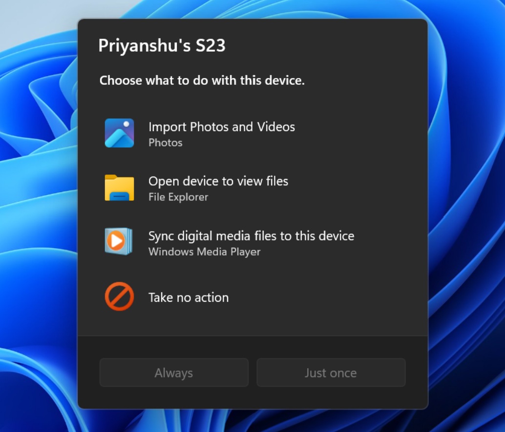
Microsoft's makeover of Windows 11 continues. A refreshed AutoPlay dialog box headlines the latest Windows Insider build.
That experience is more than a palette swap or color change. Microsoft rebuilt the experience with WinUI. That brings better performance, more visual consistency with the modern parts of Windows 11, and better responsiveness to text scaling.
The AutoPlay dialog box is a relatively small feature, but it has looked outdated for years. Microsoft's current push to polish Windows 11 includes smaller fixes like updating the AutoPlay dialog box and bigger improvements like optimizing Windows 11 for systems with 8GB of RAM.
The AutoPlay dialog box is the latest part of Windows 11 to get a modern overhaul. (Image credit: Microsoft)
Several Windows Insider builds shipped today, but I'll focus on the one available through the Experimental Channel. If you want to catch up on the smaller releases, you can check out Microsoft's collection of release notes.
Build 26340.9233
Modernized AutoPlay experience
We've updated the AutoPlay dialog that helps you choose the preferred experience when devices are connected to your PC, such as a phone, camera, or removable drive. Rebuilt with WinUI, the refreshed experience is more consistent with the rest of Windows, supports dark mode, and continues to provide the familiar AutoPlay actions you use today. The experience is also more responsive to text scaling and display settings. Notifications for this dialog are now docked in the notification center for easy access.
Accessibility
A simpler way to open apps maximized
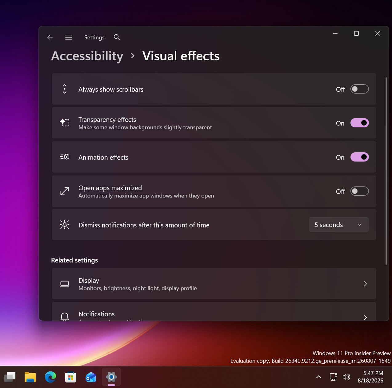
We're introducing a new accessibility setting, Open apps maximized, that automatically maximizes app windows when they open, so you no longer have to do it yourself every time. This small change removes a bit of everyday friction, whether you use a screen reader or magnification, work in tablet mode, or simply prefer a consistent, full-screen workspace.
To turn it on, go to Settings > Accessibility > Visual effects, and turn on Open apps maximized. Once enabled, Windows maximizes app windows for you as they open. Give it a try, and let us know how it works for you.
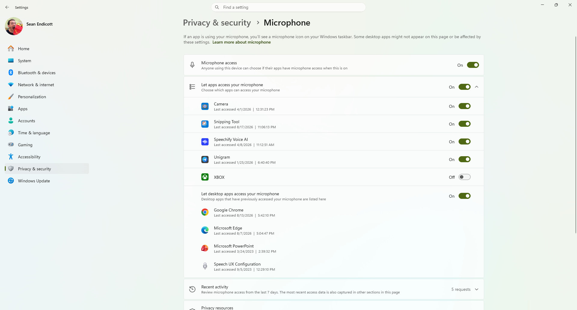
Manage camera, microphone, and location access for desktop apps
Windows Insiders can now manage camera, microphone, and location permissions for individual desktop apps. Previously, access for traditional desktop applications was managed through a single device-wide setting.
With this update, you can review and control access on an app-by-app basis, giving you greater visibility into which apps are requesting access to sensitive resources and more control over your privacy choices. Our goal is to make privacy permissions easier to understand and manage across the wide range of desktop apps people use every day.
What's changing
Allow or deny access for each desktop app individually.
Go to Settings > Privacy & security > Camera, Microphone, or Location to review and manage permissions.
Apps that haven't yet accessed a resource prompt for permission the first time access is requested.
What stays the same
Existing app permission decisions are preserved.
Apps previously granted access continue to have access.
Apps previously denied access remain denied.
No action is required, and no settings are reset.
Existing enterprise policies continue to function as designed. We're exploring additional management capabilities.
Notes
Most desktop apps appear with clear app attribution. However, some apps that rely on shared system components, browser-hosted experiences, or similar technologies might appear under a different name than expected.
Some desktop apps might appear as Unsigned if Windows can't verify publisher information. Only grant access to apps you recognize and trust.
File Explorer
PDF and non-HTML files downloaded from the web can now be previewed automatically in the preview pane.
Microsoft Store
This update provides support for in-app purchases in packaged WinUI 3 apps that require elevation, helping developers offer purchases through Microsoft's integrated commerce platform.
Taskbar
Fixed an issue in the latest builds causing taskbar animations to briefly work and then stop working.
Input
Fixed an issue in the latest builds causing the mouse cursor not to be visible in certain apps.
Other
Fixed an issue from the last flight causing Settings > Windows Update > Windows Insider Program > Flags to appear empty even though flags were available.
Updated Settings > Apps > Installed apps to show the version number at the top level for packaged apps, as it already does for other apps.
This update also includes some improvements we already knew about, including the option to open apps maximized.
It looks like Microsoft is working on a new feature for Windows 11 that will allow users to configure the behavior of apps when they first open. Right now, pretty much all Windows app will open in windowed mode, until manually set to open maximized by the user. But in the latest Windows 11 preview builds, a new option has been discovered that changes this.
First spotted by phantomofearth, the new option appears in the accessibility area of Windows Settings. The option reads: "Automatically open app windows maximized when they open" with the ability to toggle it on or off. When enabled, all Windows apps will opened in a maximized state by default, meaning the user will no longer be forced to do so for every app they open.
This feature will be great for devices with relatively small screens. PCs with screen sizes of less than 13-inches will benefit greatly from this. On my Surrface Pro 12-inch for example, I almost always find apps are easer to use when maximized as the screen it just too small to enjoy using apps in windowed mode.
The new toggle to force apps to open full screen in Settings. (Image credit: Phantomofearth on X)
This will be especially beneficial for devices with sub 10-inch screens or less, like the Surface Go line or more commonly, PC handheld gaming devices like the Xbox ROG Ally X, which has a 7-inch screen. Windows is famously not very optimized for these small screen sizes, but letting users open apps full screen will make the experience a little better.
It's also beneficial for PCs where the screen may be far away from the user, such as with a PC under a living room TV that's used primarily for watching movies or playing games. In that instance, you wouldn't want apps opening in windowed mode basically ever, and so this option will come in handy.
For a while, Windows 11 included an automatic behavior change that forced apps to open maximized on PCs with small screens, but at some point that behavior stopped. Now, it seems Microsoft is going to give users the option to enable this on any screen size, which makes more sense.
These quality of life improvements are great to see, and another example of Microsoft making WIndows 11 more customizable. Recently, it announces a whole wave of new customization options for the Start menu and context menus, with more customization to come in the next few months.
Join us on Reddit at r/WindowsCentral to share your insights and discuss our latest news, reviews, and more.
I've been gaming again lately on my desktop PC thanks to cooler weather, but thankfully I haven't experienced this new Windows 11 bug that cropped up after the August 11 (KB5121003) update.
It's apparently affecting 25H2 and 24H2 installs of Windows 11, as this update rolled out to OS builds 26200.9168 and 26100.9168.
According to Microsoft, the Windows 11 update is forcing some games to go unresponsive, crash, or reboot your PC entirely. You might also see the EXCEPTION_ACCESS_VIOLATION error pop up, forcing you to close your game.
Thankfully, it doesn't seem like the issue is too widespread. At least, not yet. Microsoft says it has received reports mainly focused on ARC Raiders, MARVEL Tōkon: Fighting Souls, and The Finals.
As of August 19, when the support page was last updated, Microsoft says it is investigating the issues to figure out if it's a problem on its side. Microsoft is asking any PC gamers experiencing a similar issue to file a report in the proper Feedback Hub app.
Embark Studios, the team behind ARC Raiders and The Finals, took to Discord to address the problem (via Windows Latest).
We’re aware of a new crash introduced with the release of a Windows update (KB5121003) that may be affecting some of you. The team is working on a fix, and we will keep you posted on any updates.
Embark Studios (via Discord)
In another post, the Embark team points at the crashes being caused by an inpoutx64.sys file change in the recent Windows 11 update. It seems like the kernel-level driver is having a hard time communicating properly.
Embark says it's working on its own "long-term fix," but in the meantime, affected gamers might be able to solve the issue on their own.
A temporary fix for the new Windows 11 gaming issues
The Finals is one game affected by the new Windows 11 update bug. (Image credit: Michael Hoglund via The Finals)
Embark has laid out the steps required to temporarily fix the crashing and freezing issues on KB5121003.
Launch Command Prompt as Administrator, type "sc stop inpoutx64", and press Enter.
In the same Command Prompt instance, type "sc delete inpoutx64" and press Enter.
Next, navigate to C:\Windows\System32\drivers in your PC's File Explorer. Find the file called inpoutx64.sys and delete it.
That should let your games run smoothly again, but hopefully we'll soon have a fix that doesn't require the manual workaround.
You can, of course, also roll back your Windows 11 PC to an older update version until the problem is officially fixed by Microsoft.
This seems like a fairly minor Windows 11 issue compared to some others we've already experienced this year, but that doesn't make it any less frustrating for those affected.
In early August, Insiders didn't get off to a good start with previews, as the company didn't release any Windows 11 builds in the main testing channels, including Experimental and Beta, for more than 15 days. However, on August 17, Microsoft made five preview builds available across different channels and testing versions, with new features and changes.
In this latest wave of previews, the company began public testing of a new fully customizable context menu. It also rolled out improvements for the background image experience, Magnifier, Camera Roll, and Get Started app.
Also, the company announced that starting with this wave of updates, the operating system will no longer ship the Windows Management Instrumentation Command-line (WMIC) and the Drag Tray feature.
In the Experimental track, we've seen builds 29648, 28120.2738, and 26340.9212, while in the Beta channel, the company announced 28020.2731 and 26220.9202.
In this recap, I'll highlight the latest and most noteworthy changes available through the Windows Insider Program.
Biggest improvements from the Windows Insider Program in August 2026
In this recap, I'll highlight the latest and most noteworthy changes available through the Windows Insider Program since my last roundup.
Redesigned context menu
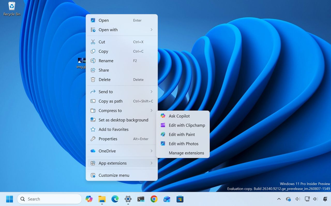
So far in August, perhaps the biggest change is the redesigned context menu, which is now fully customizable, simpler, and faster.
(Image credit: Mauro Huculak)
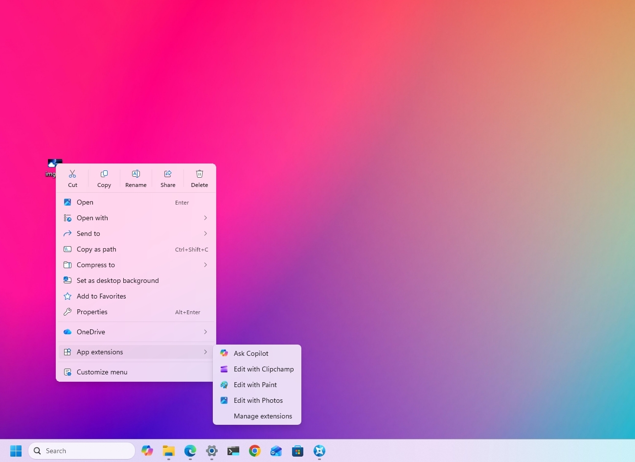
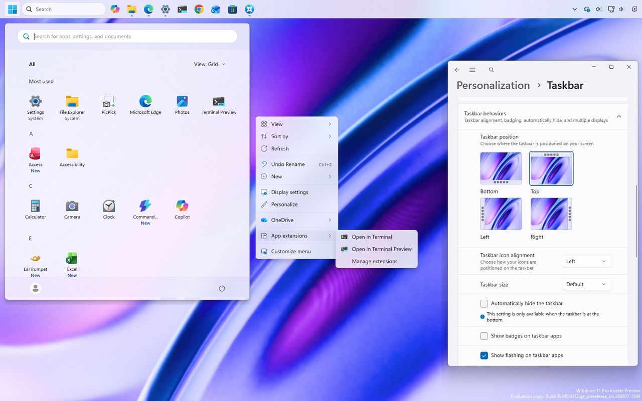
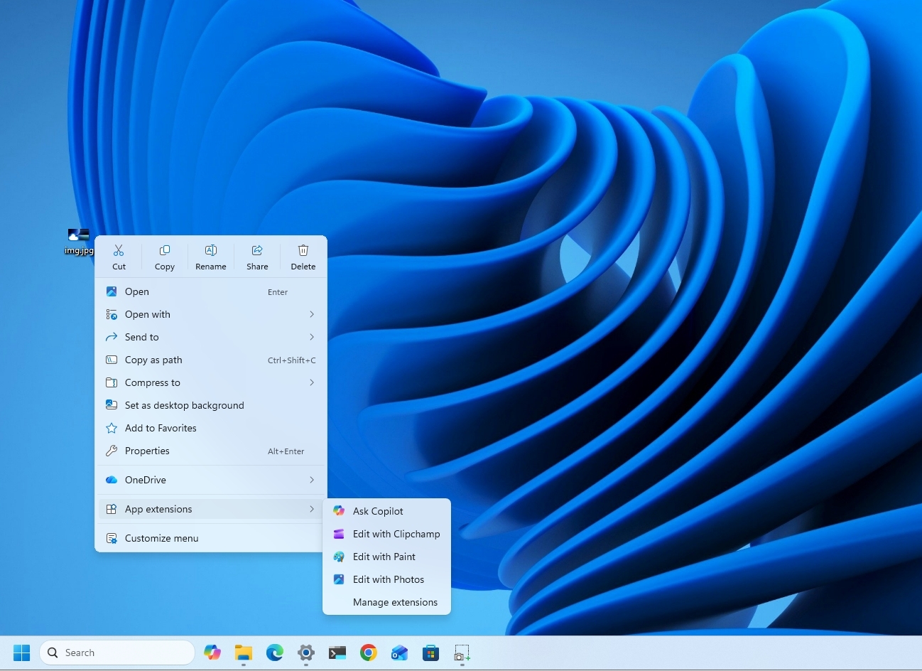
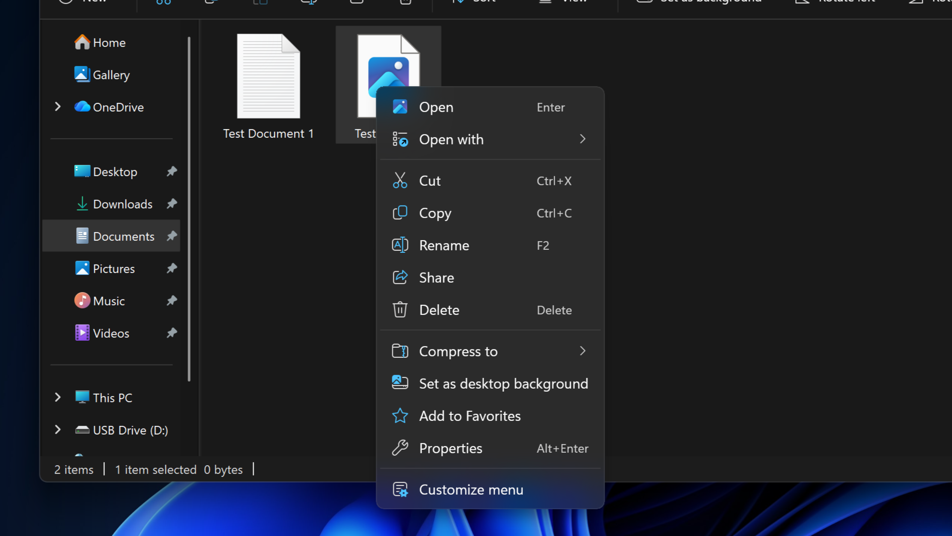
The new design reduces the clutter as we have never seen in the menu while keeping common actions easy to access. When you right-click a file or folder to invoke the menu, you'll notice a new "App extensions" submenu that now houses those extra entry points from applications you have installed on your computer.
Also, there's a new "Customize menu" option that opens the new Context menu page in Settings > Personalization.
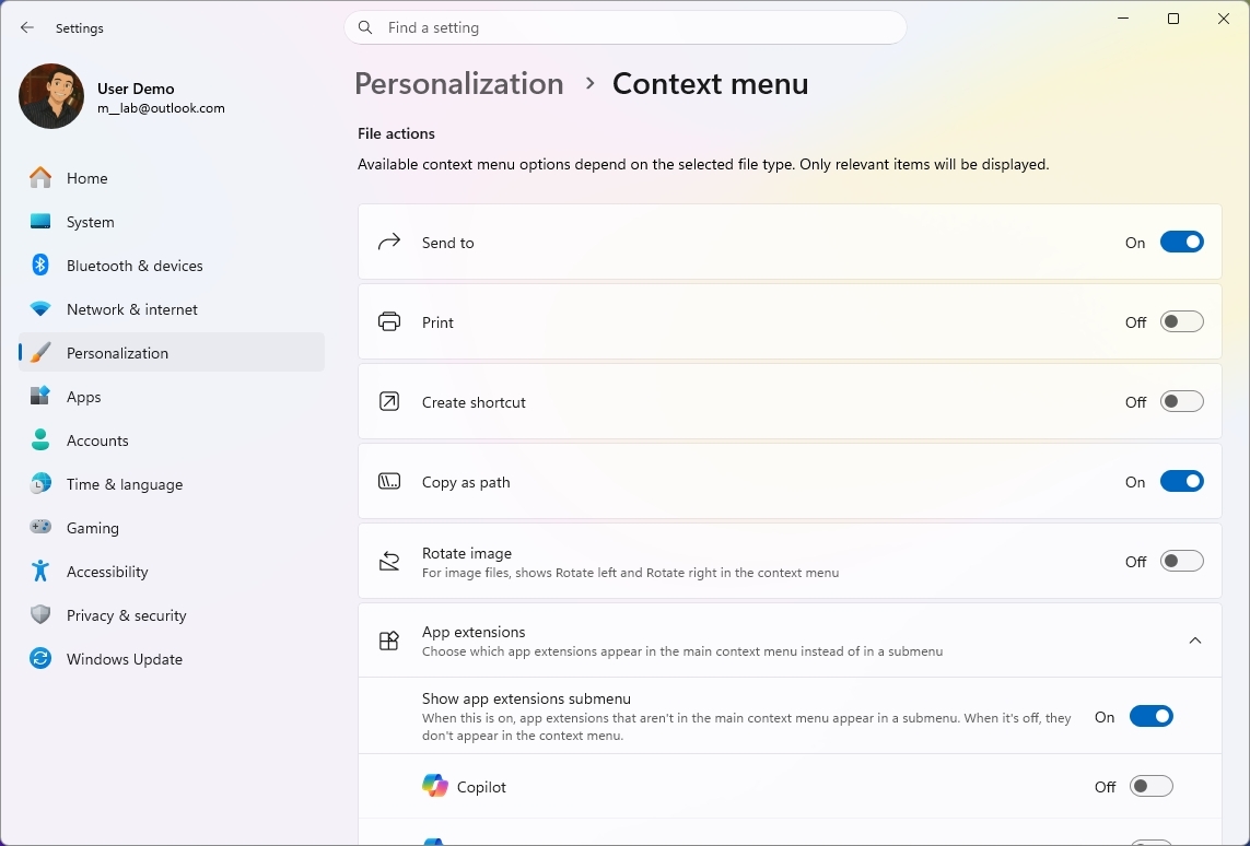
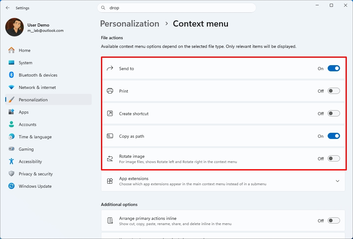
Under the "File actions" section, you can choose the options that you want to appear in the main context menu, such as "Send to," Print, Create shortcut, Copy as path, and Rotate image.
(Image credit: Mauro Huculak)
One thing to point out here is that the "Send to" and Print options are new to the modern menu design.
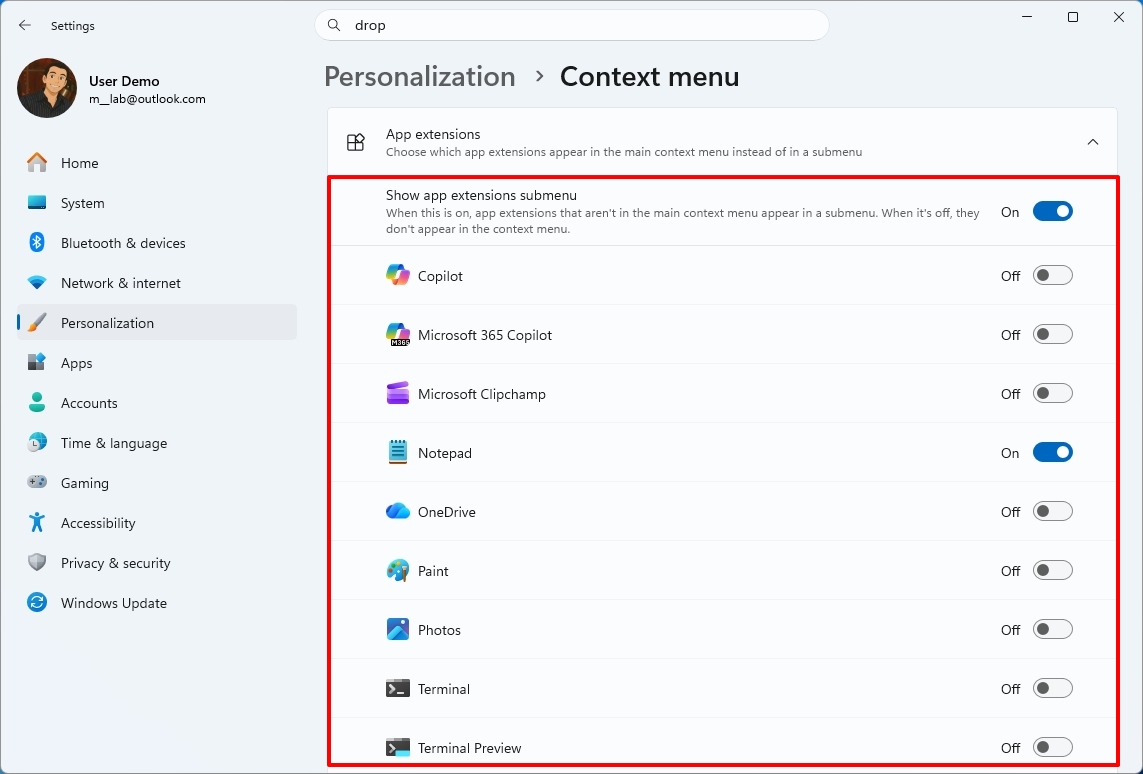
When you open the "App extensions" section, you can decide whether this submenu appears in the main menu. Also, you can choose which extensions from apps appear in the main menu.
(Image credit: Mauro Huculak)
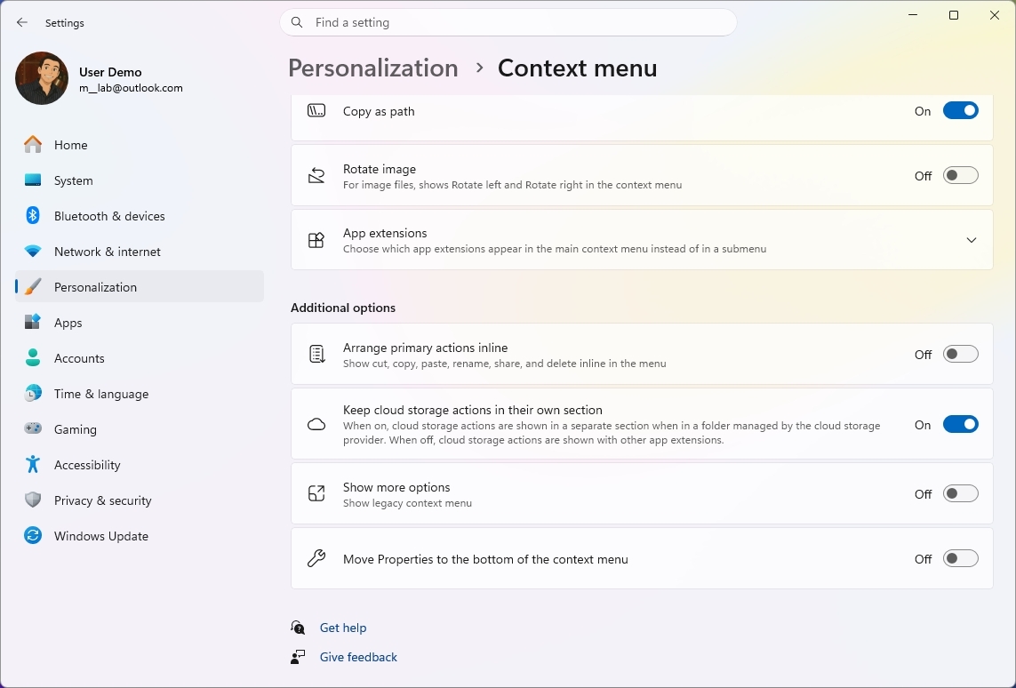
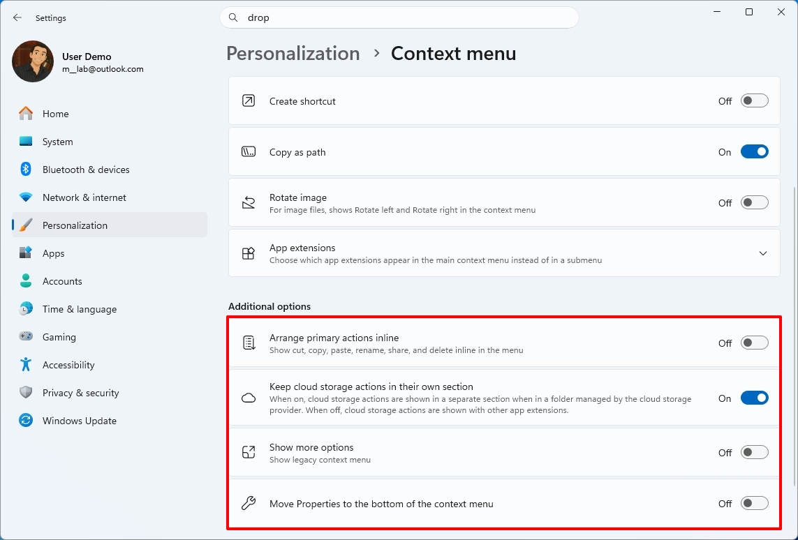
Microsoft notes that it understands that many people have accumulated years of muscle memory from Windows 10. As a result, the new menu adds options to make it easier for those users by letting them arrange primary actions (such as cut and paste) vertically, instead of in the new horizontal view.
(Image credit: Mauro Huculak)
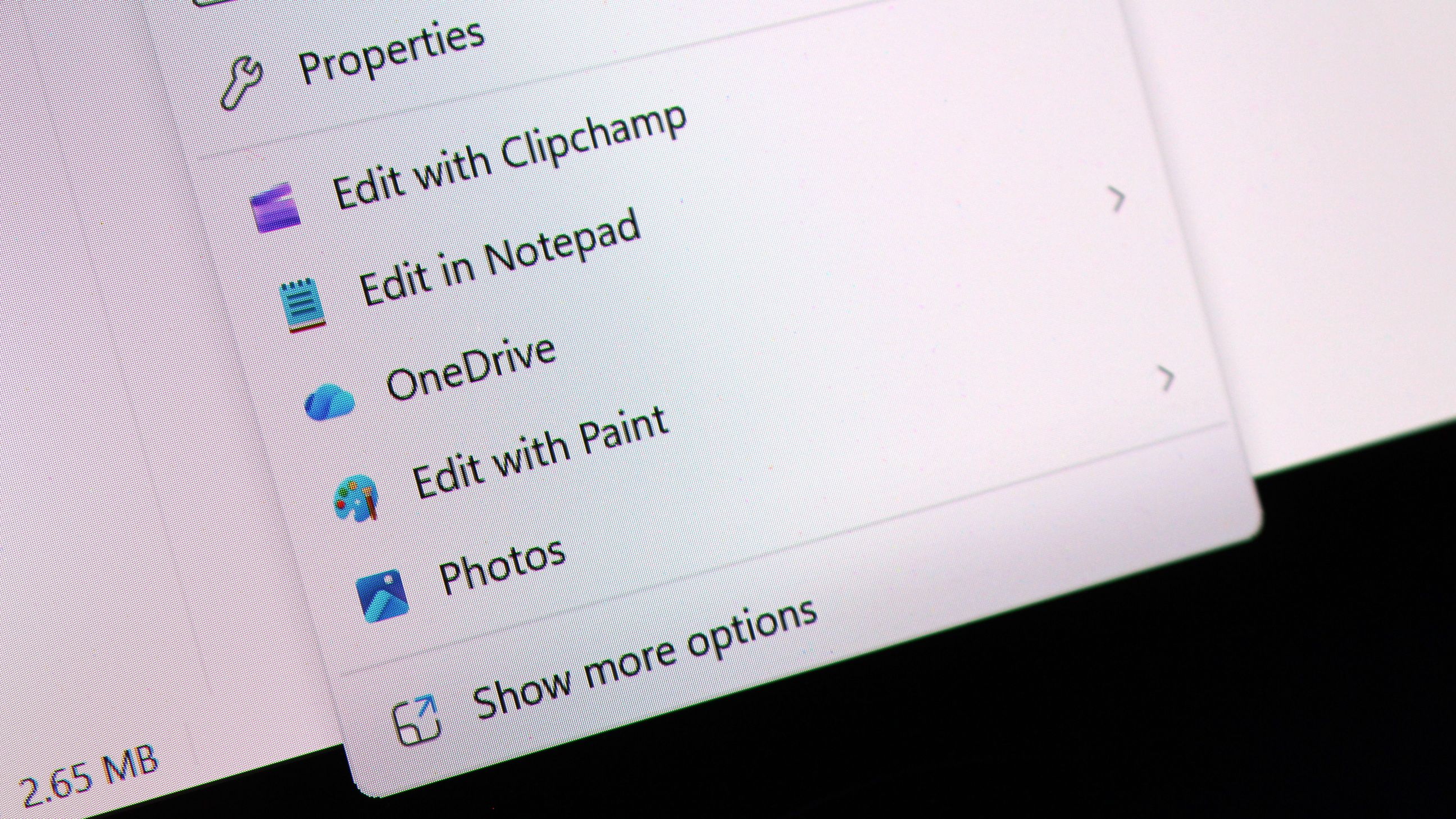
Also, you can place the "Properties" option at the bottom of the list, like in older versions of Windows.
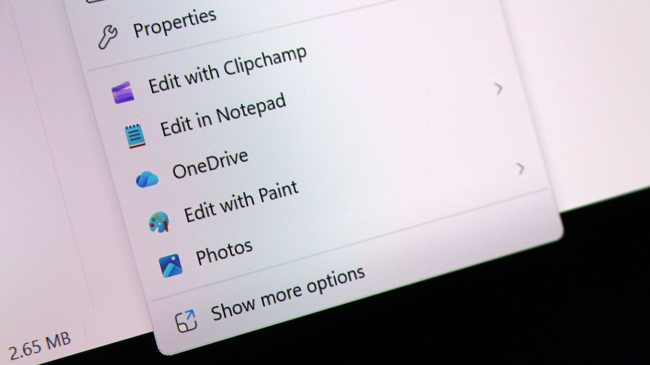
Finally, it's also possible to restore the "Show more options" entry, or you can continue accessing the classic menu using the "Shift + Right-click" shortcut.
The new context menu options are available on build 26340.9212 for version 26H2 in the Experimental channel.
Personalization improvements
On Windows 11 build 26340.9212, the company is also polishing the desktop background experience with several fixes and improvements.
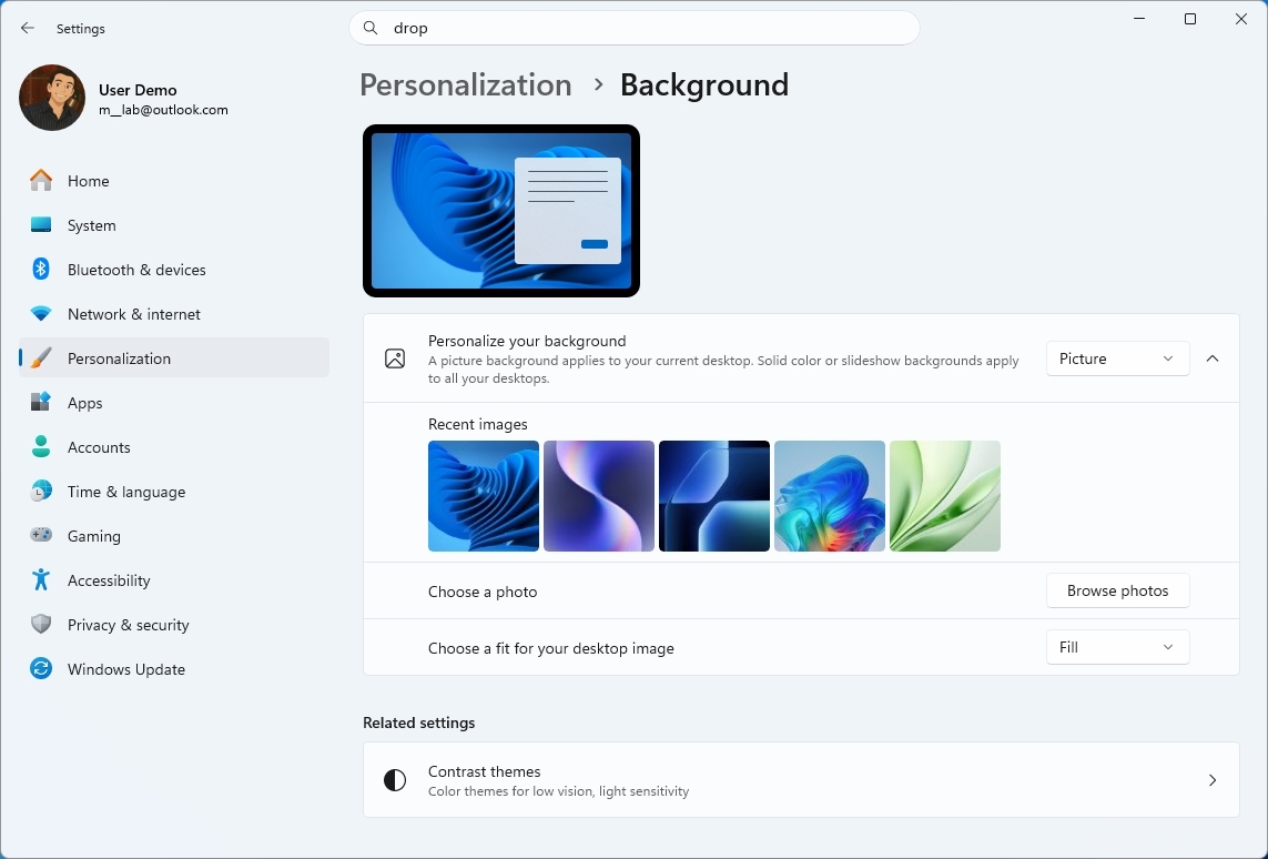
For example, on Settings > Personalization > Background, the page should now be more reliable, previews now render at higher resolution and display better on portrait monitors, and desktop slideshow transitions are more dependable, including on newly created accounts.
(Image credit: Mauro Huculak)
The system can now also improve the process of changing wallpaper quickly, use Device-Independent Bitmap (DIB) image files as backgrounds, and keep slideshow wallpapers enabled across multiple desktops instead of automatically switching back to Picture.
Camera Roll backup
Also, on build 26340.9212, Microsoft is making it easier to protect your pictures by adding new entry points in Settings > Home and Accounts that let you set up Camera Roll backup, which automatically backs up photos and videos from your mobile device to OneDrive.
Magnifier interface update
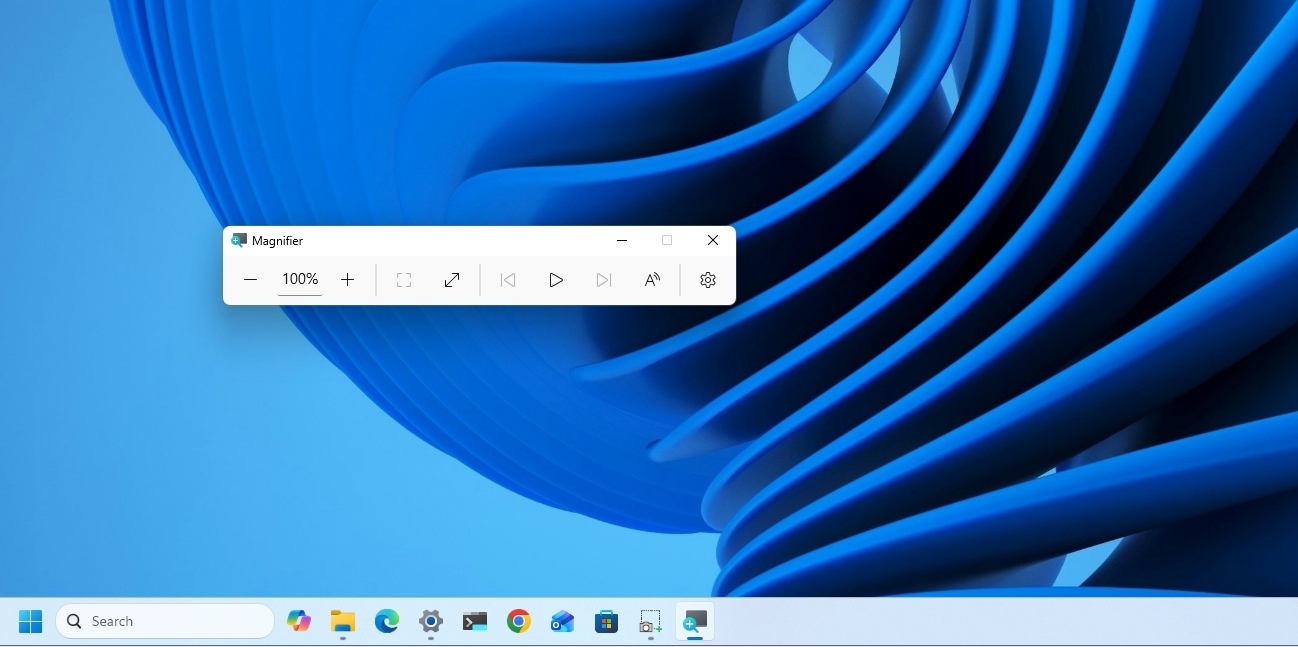
Magnifier is getting a cleaner look without changing how the accessibility tool works.
(Image credit: Mauro Huculak)
Microsoft has refreshed the toolbar icons to better match the operating system's visual design and refined the spacing and padding for a more polished layout.
This update is currently available only in version 26H2, starting with the release of build 26340.9212.
Windows Recovery Environment changes
Windows Recovery Environment (WinRE) is getting a useful networking upgrade that can automatically reuse eligible Wi-Fi profiles saved in the operating system, including supported certificate-based networks.
In the past, this recovery mode could automatically connect to wired unauthenticated Ethernet or separately preconfigured Wi-Fi, while other WPA2/WPA3 networks required manually entering a password.
In this update, recovery workflows such as Quick Machine Recovery or cloud rebuilds can get online without manual interaction, without having to reconfigure Wi-Fi credentials.
The behavior is enabled by default, although technical users can disable it if needed.
Windows 11 features removed
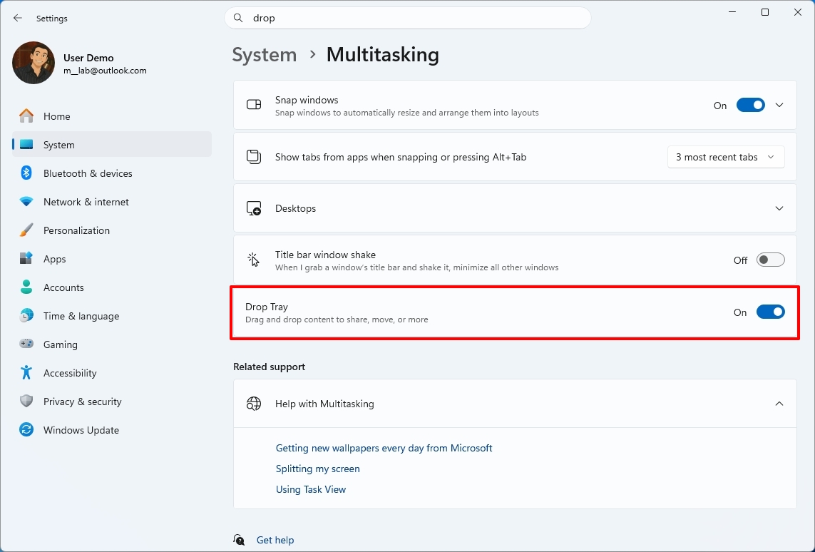
In this wave of updates across all channels, Microsoft is no longer shipping Windows Management Instrumentation Command-line (WMIC) and the Drag Tray feature.
In this release, the legacy Windows Management Instrumentation Command-line (WMIC) tool is no longer included as Microsoft continues its broader effort to phase out WMIC from the operating system, pushing users toward newer management tools.
One thing to point out about WMIC is that Microsoft isn't removing WMI. Only the "wmic.exe" command-line utility will no longer be included in the operating system. WMI remains available through PowerShell and other supported utilities.
(Image credit: Mauro Huculak)
Microsoft is also pulling the plug on the Drop Tray experience from this build after hearing feedback from users. The company says it'll continue exploring improvements in this area and plans to share more about a future replacement in a later update.
File Explorer improvements
In Windows 11 build 26220.9202 for version 25H2 (Beta), File Explorer gets a small but noticeable usability boost.
For example, the "Home" page now launches faster and feels more responsive, while the "Recommended" section supports touch scrolling, making it easier to browse files in the carousel.
Microsoft also fixed an issue that caused previews to display an unexpectedly thick band across the middle.
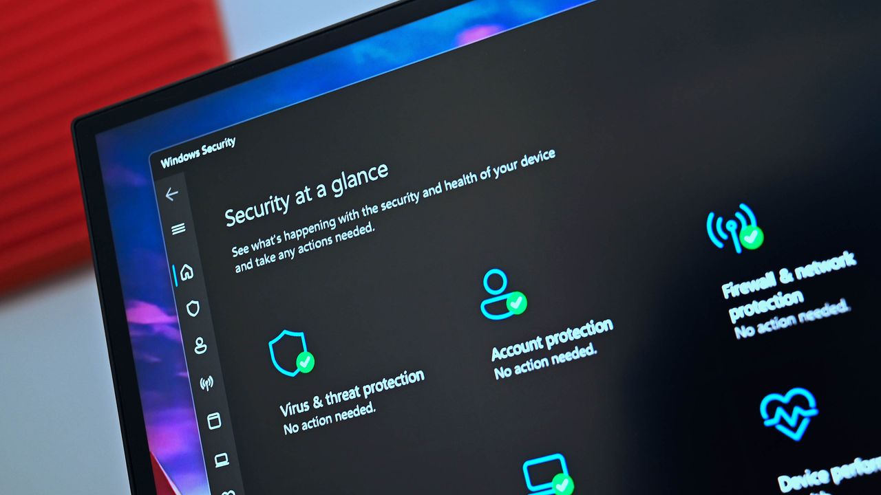
Windows Security app changes
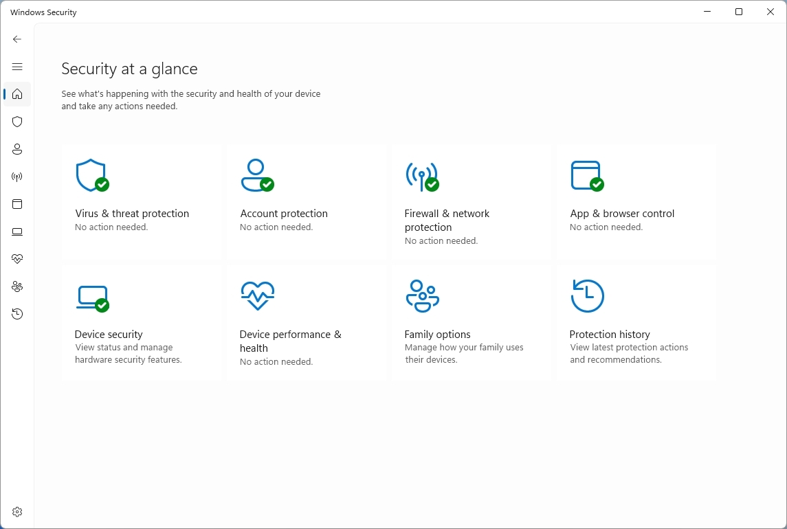
Finally, the company is making small visual adjustments to Windows Security to better align the app with the other Windows 11 experiences.
(Image credit: Mauro Huculak)
On Windows 11 build 29648, testers may notice subtle differences as more changes roll out. However, after installing this update on my machine, I failed to notice anything different in the app.
On managed devices with Microsoft Defender for Endpoint enabled, information about the protection will now appear at the top of the "Virus & threat protection" page.
Windows Central's Take
Although Microsoft kept Insiders without preview builds for the first half of August, the latest updates are still worth the wait because the company is finally giving users more control over parts of the experience it previously tried to simplify. The customizable context menu is the most significant change, especially because it acknowledges that users don't necessarily want the company's preferred layout forced on them.
I'm also glad the improvements aren't limited to interface changes. The improvements to desktop backgrounds, File Explorer, and WinRE address small frustrations that can make the experience feel inconsistent over time.
I wouldn't rush to install an Insider build just for these changes, but the direction is encouraging. Microsoft is giving Windows 11 more flexibility while continuing to modernize the parts of the operating system that have fallen behind.
What are your thoughts about these latest Windows 11 changes? Let me know in the comments.
More resources
Explore more in-depth how-to guides, troubleshooting advice, and essential tips to get the most out of Windows 11 and 10. Start browsing here:
The problem was flagged on Reddit by user Huynh_Jovi. Several users in that thread have had issues running scans with Microsoft Defender. Both Full Scan and Quick Scan appear to be affected.
"It appears Microsoft released a bad update to Windows Defender, causing it to crash a few seconds after attempting to perform a Full Scan or Quick Scan," reads the comment by user goretsky. They continue, stating, "Offline scans reportedly stop at around 90-93% of completion." The latest version of the Microsoft Safety Scanner is reportedly affected as well.
The exact cause of the issue has not been determined, though there are several suggested causes. The issue seems to be related to a Microsoft Security Intelligence update. Performing an upgrade to Security Intelligence Update v1.457.236.0 resolves the issue, according to Reddit users Schoonie84 and Master_Pie1940.
You don't need to hunt down that update manually. If you check for updates in the Windows Security app or through Windows Update, the latest version should appear.
There's a chance the issue appeared after Microsoft attempted to mitigate ShieldBreak, a zero-day vulnerability disclosed shortly after August's Patch Tuesday update.
Versions v1.1.26070.7 and v1.1.26080.2 of Defender are said to be affected by the issue when used with any of the following Microsoft Security Intelligence Update versions:
1.457.222.0
1.457.225.0
1.457.226.0
1.457.227.0
1.457.230.0
Restoring to an older Microsoft Security Intelligence update also reportedly fixes the issue, adding weight to the theory about the cause of the problem.
Many users have spent hours trying to address the issue. At the time of publication, there has not been official word on the problem from Microsoft, so the work of the Reddit users taking a closer look is appreciated.
Performing regular scans is an important step in securing a PC. Hopefully Microsoft can resolve the issue quickly and get word out to affected users.
In the meantime, affected users can still scan a specific folder or drive by right-clicking and selecting "Scan with Microsoft Defender."
Join us on Reddit at r/WindowsCentral to share your insights and discuss our latest news, reviews, and more.
Windows 11 will soon give you greater control over the permissions your apps have. A new feature hidden away in the latest Experimental Insider Build (26340.9212) lets you block access to your camera and microphone on a per-app basis for Win32 apps.
The change was spotted by X user @jakub25050. Well-known Windows sleuth @phantomofearth confirmed that the change appears on their system as well when running build 26340.9212 and after enabling Win32SignatureIdentity (60730253). On X, @jakub25050 noted that they did not have to enable any feature flags.
Microsoft did not discuss the change in the official release notes for the latest Windows Insider build.
Huge changes are coming to Windows 11 privacy & security. In the latest Experimental Insider Build (26340.9212) you can now revoke access to the camera & microphone for specific Win32 apps!cc: @pavandavuluri @phantomofearth @XenoPanther @windowsinsider @zacbowden @tomwarren pic.twitter.com/0UDOrgxsXSAugust 18, 2026
This behavior will feel familiar to most people who use a smartphone, since both iOS and Android have fine-tuned privacy controls. Windows 11 has also supported this functionality for other types of apps for a while.
What's changing with Windows 11 privacy settings?
Per-app options for microphone and camera permissions have been limited to certain types of apps until recently. (Image credit: Future)
Windows 11 already has an option that allows or blocks desktop apps from accessing things like your microphone or camera. But you can only enable or disable those permissions on a per-app basis for certain types of apps.
The feature in testing right now allows you to toggle camera and microphone permissions on a per-app basis for Win32 apps. That's a massive addition since many popular programs are Win32 apps, such as Discord, Chrome, and game launchers like Steam.
The current way app permissions work means that to use your webcam on a browser like Chrome, you'd also need to have your settings configured to let other desktop apps access your webcam.
I've seen some debate about when the per-app option for Win32 apps rolled out to Windows 11. While Windows 11 has had the option to grant or deny permissions for years, that choice was limited to UWP/MSIX apps and was not available for Win32 apps.
Build 26340.9212 started shipping to Insiders in the Experimental Channel on August 17, 2026. Assuming testing goes well, we could see the expanded app controls roll out to everyone in the near future.
Join us on Reddit at r/WindowsCentral to share your insights and discuss our latest news, reviews, and more.
Fixing Windows may be an impossible task, at least if the goal is to please every user. Because Windows has been around for decades and is used by billions of people, Microsoft has to be careful in how it rolls out changes to its operating system.
One of the strengths of Windows is backward compatibility, but that is a double-edged sword. Because Microsoft values legacy software and compatibility, Windows 11 is basically several operating systems stacked together under a trenchcoat.
I've argued before that unifying the look of Windows should have been a priority for decades. But even if it were, updating Windows would be a challenge. People get used to things and often dislike changes, even if they're considered improvements by many.
With changes like the overhauled Start menu and movable taskbar on the way, I shared a poll recently asking about Microsoft's improvements to Windows 11. That poll was inspired by the recent change to how file sizes are displayed in File Explorer.
40 percent of those who voted said that "Some tweaks are great, but others feel like changes for the sake of change." Another 32 percent of participants said Microsoft should "bring on the modern polish," noting that they adapt quickly and prefer clean interfaces.
Almost 30 percent of voters wanted to ensure some level of consistency, whether that be keeping legacy options (17 percent of voters) or leaving features and layouts alone (12 percent).
The fact that even our readers are split shows how divisive this topic can be. Generally speaking, our readers are tech-savvy and keep up to date with tech and new features, so they should be able to adapt to changes well. But being able to adapt is not the same as favoring the need to adapt.
At this point Microsoft cannot do it right for everyone anymore. Whatever they change, they'll disappoint someone. What one loves, the other one hates. One still uses legacy software from 30 years ago; the other one is using only brand-new apps that the employer provides.
Q-Less in comment on Windows Central
The comments on that article echoed sentiments about Microsoft not being able to please everyone, such as the quote above by "Q-Less." They also noted that "Microsoft needs to spend significant effort on change management."
Over the years, Microsoft has tried different strategies. Major OS updates such as Windows 7 or Windows 10 bring many changes at once and allow Microsoft to roll out improvements as part of a package.
Incremental updates shipped every few months let Microsoft get improvements to users quickly, but that may not be a good thing. People need time to adapt to changes, even good ones. Having an interface or experience tweaked several times in a year can be jarring.
One route Microsoft could take is adding options.
They should add a new option to set it on and off. They already have an options screen, just add it there and let people decide.
Incom2 in comment on Windows Central
I like having options, and Microsoft sometimes ships new features with a toggle to go back to the previous interface. But there's a limit on how many choices can be built into Windows 11. If Microsoft kept every option across several OS generations, Windows would be a mess.
Some want Microsoft to take the "if it ain't broke, don't fix it" approach.
Stop messing with the UI. I'm a power user/retired sys admin and I had gotten very proficient with the PERFECT Win 7 UI. Then µslop just had to change it. Then I had to spend time and effort to re-learn new ways to do everything that I had become fast and efficient at. A huge waste of time and decrease in productivity. Go ahead & fix the underlying code to make it more secure & trim out bloat, but LEAVE MY UI ALONE!
Jimbo in comment on Windows Central
Within the Windows Central community, there is debate on how to handle changes and improvements to Windows. Expand the discussion to all PC users and you have an almost deafening amount of noise to sort through.
Even when Microsoft settles on changes to Windows, the company needs to decide how to package those changes. Last week's Windows Wrap asked if the next big update should just be Windows 12.
Windows carries over much of its base when switching between major OS versions these days, so it's more about marketing than a technical definition.
Where do you stand in the debate? Do you want to see Windows modernized even if it means you'll have to adapt to changes? Or do you want Windows to stay largely the same? Let us know in the comments!
Join us on Reddit at r/WindowsCentral to share your insights and discuss our latest news, reviews, and more.
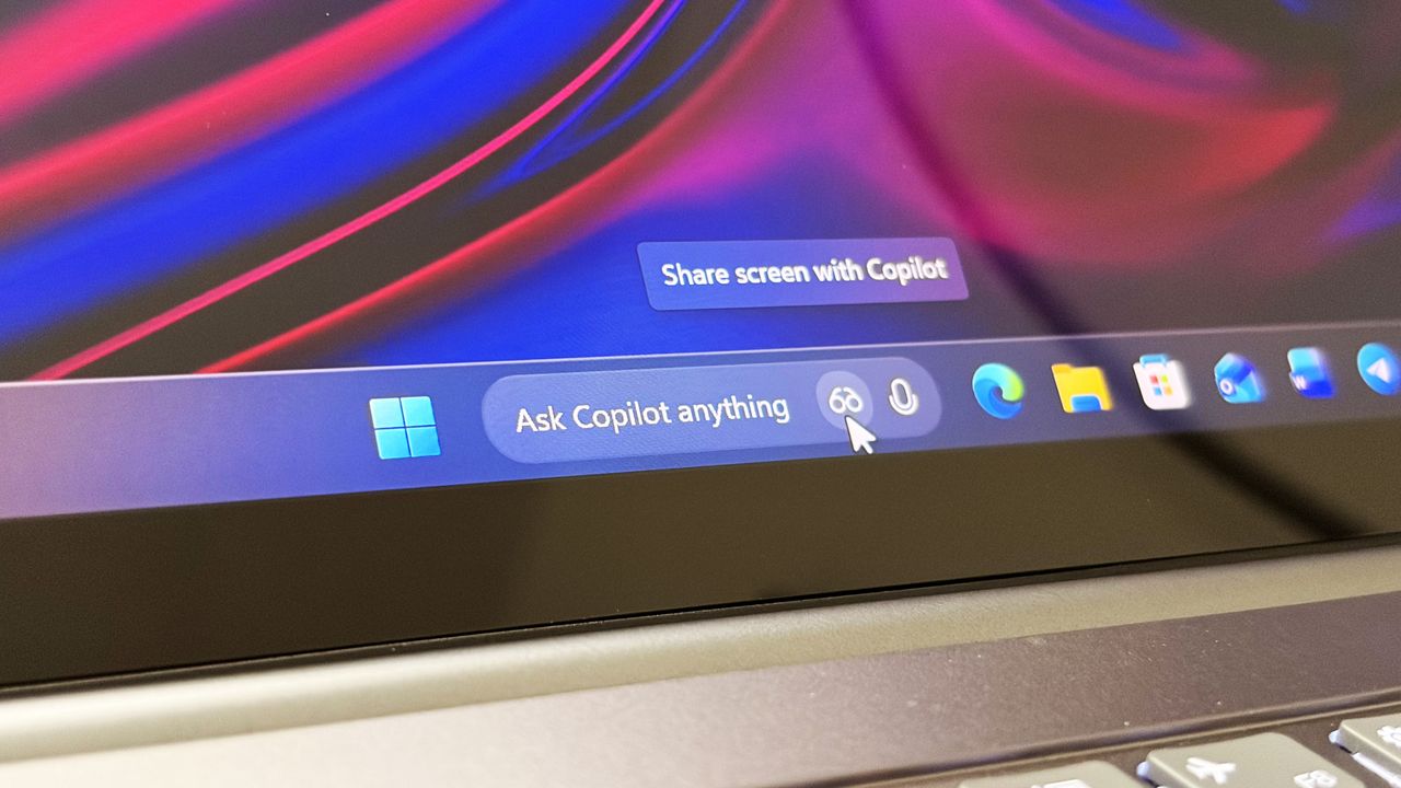
Last year, Microsoft announced a major update coming to the Taskbar on Windows 11 that would allow users to swap out the Windows Search box for one powered by Copilot. Dubbed "Ask Copilot," this new experience would let users interact with Copilot straight from the Taskbar, while maintaining support for searching for apps and files.
Since its announcement, the feature has slowly rolled out in preview to a small subset of users. Most of those users are commercial customers utilizing the Microsoft 365 Copilot app, but a version for consumers was also being developed for the standard Microsoft Copilot app.
At least, that was true until a few months back, when an update to the consumer-facing Copilot app removed support for it. Since then, Ask Copilot has only worked with the Microsoft 365 Copilot app, but with the announcement that the consumer Copilot and Microsoft 365 Copilot are merging under one app experience, Ask Copilot is disappearing once more.
"As we implement these changes, we're temporarily disabling Ask Copilot on the taskbar to update the new experience and incorporate your feedback," a Microsoft changelog has confirmed. The company doesn't explain what user feedback it's taking onboard, or if the Ask Copilot experience will change in any meaningful way. For now, it's no longer in testing.
If you've been using Ask Copilot on the Taskbar, the latest updates to the Copilot app and Microsoft 365 Copilot app will result in the feature disappearing, restoring the standard Windows Search experience automatically.
The UI between Ask Copilot and Windows Search is different. In fact, the two experiences are handled by entirely separate teams at Microsoft. Windows Search is, naturally, developed by the Windows team, whereas Ask Copilot is built by the Copilot and Microsoft 365 AI teams.
Recent upgrades to the Windows Search experience confirm that Ask Copilot is always going to be a separate, optional experience for users who want it. Windows Search is still the primary search experience on Windows, and is being redesigned to remove clutter, ads, and prioritize more accurate and speedy results.
The Ask Copilot search pane is similarly decluttered, but includes a chat box for initiating conversations with Copilot, along with shortcut buttons in the Taskbar for launching into Copilot Vision. If you're someone who has been looking forward to the Ask Copilot experience, it looks like you're going to be waiting a while longer before it begins shipping.
Join us on Reddit at r/WindowsCentral to share your insights and discuss our latest news, reviews, and more.
Microsoft has today announced a set of major improvements coming to the context menus that appear in File Explorer and the desktop on Windows 11 that are designed to make the right-click experience faster, less cluttered, and more customizable.
I first revealed Microsoft's plans to overhaul the context-menu system on Windows 11 last month, and now the company has confirmed those plans. In fact, it's already rolling out preview builds with the new context menu system in place, ready for Windows Insiders to begin testing and provide feedback on.
Microsoft says that it knows the context menu system on Windows 11 today is not in a good place. "The menu became cluttered and sluggish, and we recognized the need to dramatically reduce the time between right-clicking and having a menu that’s fully ready to use," says Microsoft engineer Michael Novak in a blog post published today.
"Today, we’re excited to announce an updated context menu that delivers a faster, simpler, and more customizable experience. The new design reduces top-level clutter, keeps commonly used actions easy to access, and introduces a new Settings experience that gives you more control over what appears in the menu."
I went hands-on with the new context menu system over the weekend, and I can confirm that the new right-click experience is a major improvement over what is shipping on Windows 11 currently. The new default layout is much less cluttered, with less actions immediately presented to the user in exchange for a much faster response time.
Microsoft is finally letting users customize the context menus too. You can now enable and disable whichever actions you want, as well as show or hide app extensions from third-party apps. This is great for when an app installs itself into your context menus without permission, as you can now hide them from view.
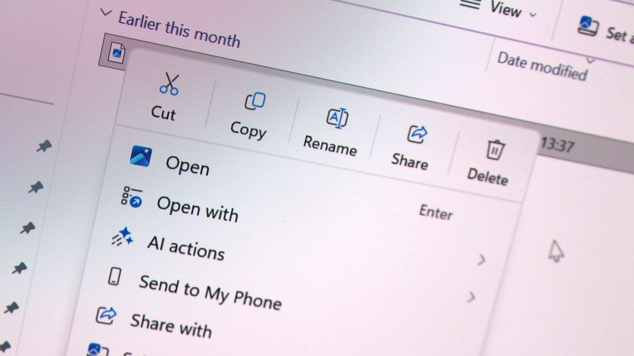
It's even going so far as to allow users to restore the Windows 10 context menu layout within the modern Windows 11 context menu system. Until now, Windows 11's context menu has placed "primary actions" such as cut, copy, and paste into a horizontal view along the top of the menu. Windows 10's context menu placed those actions vertically alongside everything else, and now Windows 11 is letting users restore that layout for users that want it.
"We know many people have years of muscle memory from the Windows 10 menu, so we’ve added options to bring that feel back. You can list the main commands (Cut, Copy, Paste, Rename, Delete, and Share) inline directly in the menu instead of as a row of icons, and you can move Properties down to the very bottom."
These are genuinely good quality of life improvements coming to Windows 11, and Windows Insiders can download the latest Windows 11 preview builds to begin testing them today. Given that they only just entered preview, I expect we won't see them begin shipping to everyone until later in the fall.
Join us on Reddit at r/WindowsCentral to share your insights and discuss our latest news, reviews, and more.
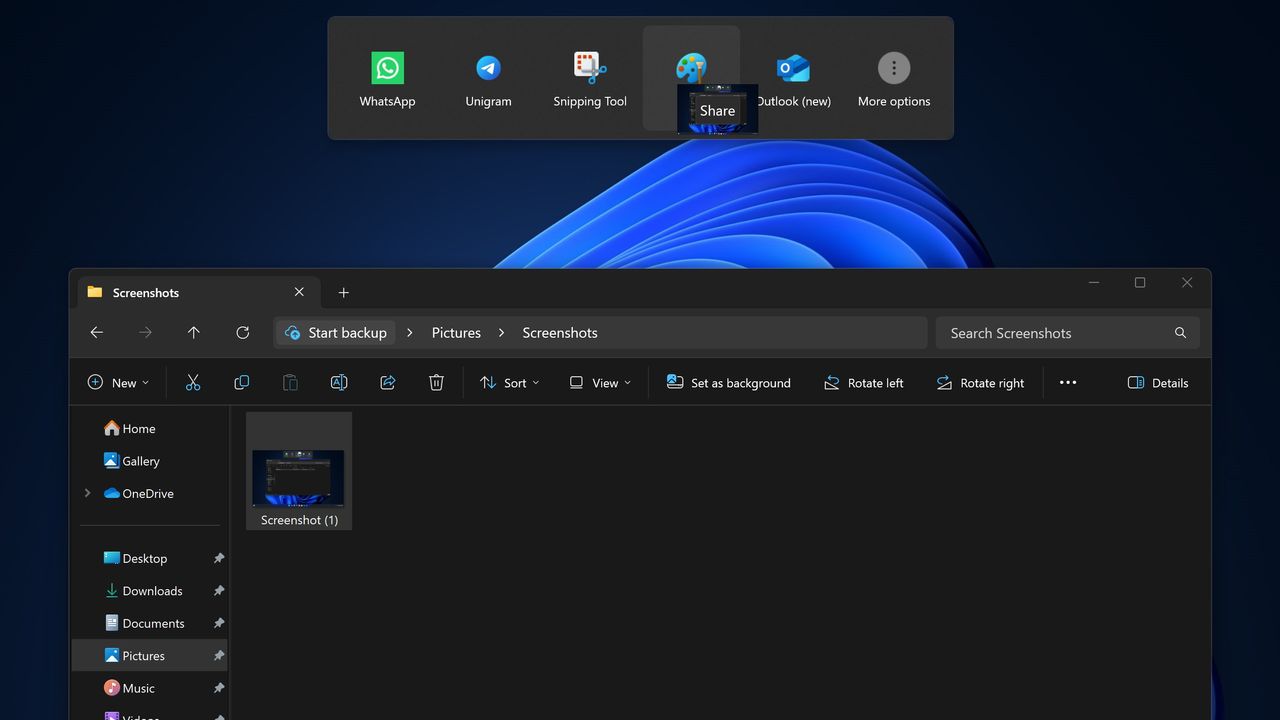
Microsoft has announced that it's disabling its unique Drag Tray file sharing experience on Windows 11 after feedback from Insiders. After initially rolling out to a small subset of users a number of months ago, it appears the company is now scrapping the concept in favor of something else.
"Based on feedback, we're removing the experience in this build," Microsoft says. "We're continuing to explore improvements in this area and look forward to sharing more about a future replacement experience in a later update."
The Drag Tray experience was a unique way of sharing files from the File Explorer on Windows 11. It has been in testing for well over a year, and appeared at the top of the screen whenever a user grabbed a file with their cursor. Users would be able to drag the file to the top of the screen and drop the file into an app to instantly share it.
The feature works well on paper, but users online complained about the feature when it first began rolling out, with some calling it frustrating and annoying. While some users found it useful, most users did not like its implementation and sought out guides to disable it.
Windows 11 features multiple ways of sharing files. Most users share files by right-clicking on the file in particular, and clicking share, which opens a dedicated share UI window that makes it easy to send the file to contacts or apps that are installed. The drag tray was supposed to be a faster and easier to use alternative.
Microsoft hasn't yet revealed what will replace the Drag Tray, if anything. While the company says that it's exploring improvements in this area, there's no guarantee that the Drag Tray in this implementation will survive. Given the pushback it received from users originally, it's unlikely to return in its current form.
If you're using Windows 11 with the Insider Program, you'll notice the Drag Tray is gone as of the latest preview builds. If you're running production builds of Windows 11, Drag Tray is still available, but it's likely only a matter of time before Microsoft removes it from shipping builds of the OS too.
Join us on Reddit at r/WindowsCentral to share your insights and discuss our latest news, reviews, and more.
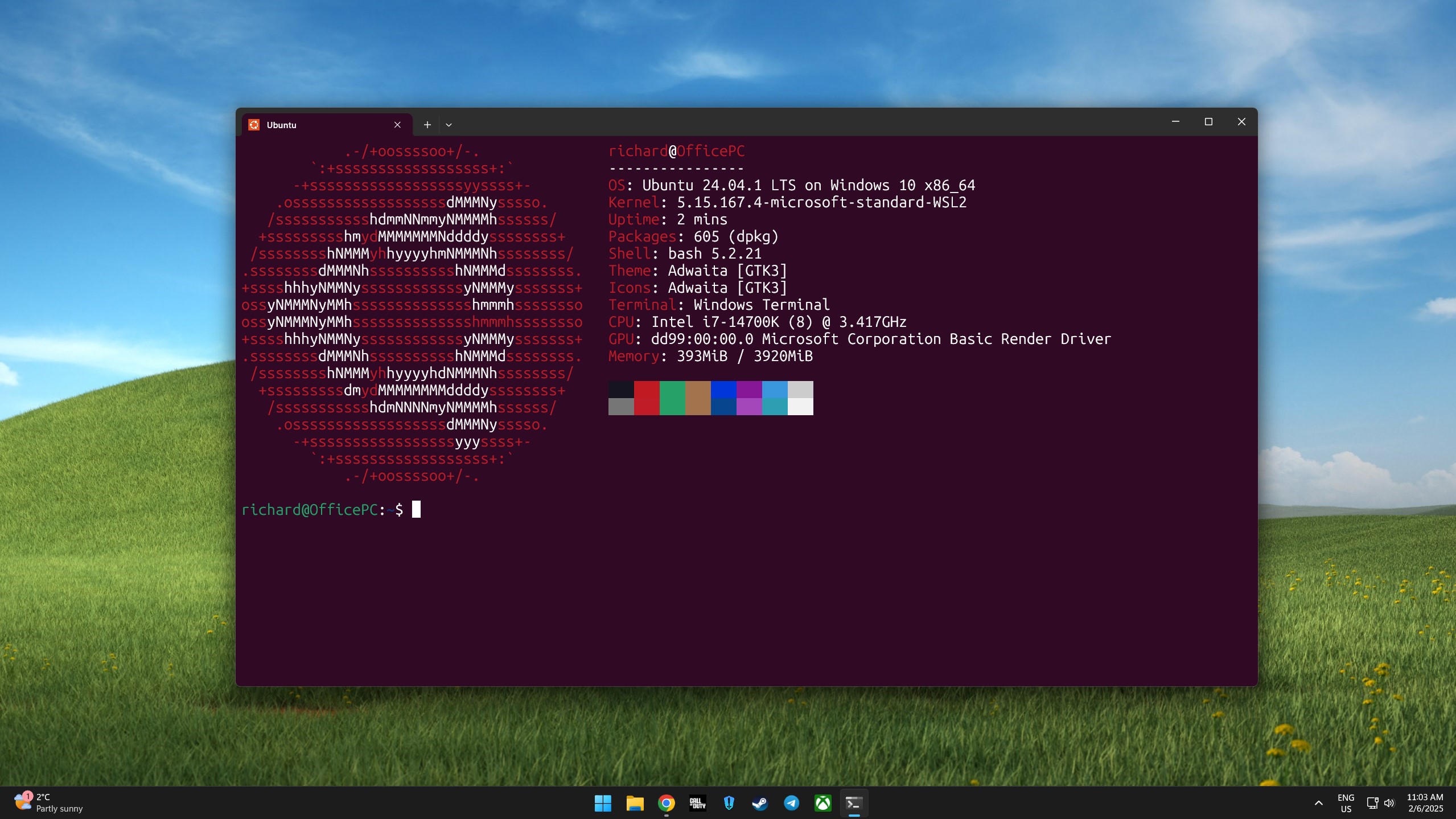
I'm a big fan of the Windows Subsystem for Linux (WSL) not least because I like Linux, and it means I can run it from the same PC as Windows 11 without the need for virtual machines or dual-booting.
It's been around for quite a while now and is a pretty powerful tool for developers, especially, and it's come to light that for Canonical, at least, WSL might soon be the biggest source of users of Ubuntu.
Not only is Ubuntu growth on WSL continuing to increase, it's actually starting to outpace the desktop. So much so that it's expected that Ubuntu on WSL will soon be bigger than native Ubuntu use.
“In a year, the growth in our WSL numbers is significantly higher than the growth in Desktop usage numbers. I expect to see more Ubuntu WSL users than ‘native’ Ubuntu users over the coming months.”
Jon Seagar, VP of Engineering at Canonical
Obviously Linux is more than just Ubuntu, and its overall use is still dwarfed by Windows 11. But Ubuntu is one of the biggest distros, and this is pretty interesting to hear.
WSL does have GUI support for apps, but it's not the same as running a full desktop, but in most cases, developers and system admins don't need a full desktop. The terminal is just fine, and WSL has seamless integration into Microsoft's VS Code as well.
I've written in the past that WSL is a great tool to use to learn about Linux as a beginner since you can fire it up within the comfortable surroundings of your existing Windows 11 PC. But that same principle can apply for professionals who need access to both.
Ubuntu use on Windows 11 is expected to eclipse the regular desktop version this year. (Image credit: Windows Central)
It's convenient and gives access to the Linux tools needed, including nowadays for AI, and some tools are built specifically for or work best on Linux. But with WSL you have integration with your existing Windows 11 file system.
I use probably 5% of the potential of WSL on my own PC, but it's still one of the first things I set up whenever I'm moving on to a new machine. You're not limited to Ubuntu, either, with Fedora my own distro of preference. But there's plenty to choose from.
Microsoft keeps improving it, too. The most recent development is WSL Containers, and it even has its own version of Linux now for users to deploy in Azure Linux. There are still plenty of cases for having a bare-metal Linux machine, but with Windows 11 and WSL working together, you've got a hybrid that's good enough for many.
Join us on Reddit at r/WindowsCentral to share your insights and discuss our latest news, reviews, and more.
Microsoft is finally paying more attention to some of the oldest parts of Windows 11, and I hope it doesn't stop with the obvious ones.
For years, the operating system has had a strange split personality. Some parts of the system look and feel as if they were designed specifically for Windows 11, while others still feel like they were carried over from much older versions. But that's slowly starting to change.
Microsoft has been modernizing parts of Windows 11 for years, gradually updating interfaces that have remained largely unchanged. We've seen this work arriving in the Run dialog, Task Manager, shell controls, parts of File Explorer, and many other areas. Recently, however, Microsoft has been talking more openly about the challenges of modernizing deeply embedded components and developing the tools and frameworks needed to make that work easier without breaking the functionality people still depend on.
That's encouraging because I don't think the operating system needs another redesign just for a new coat of paint. There are much more important parts that deserve Microsoft's attention.
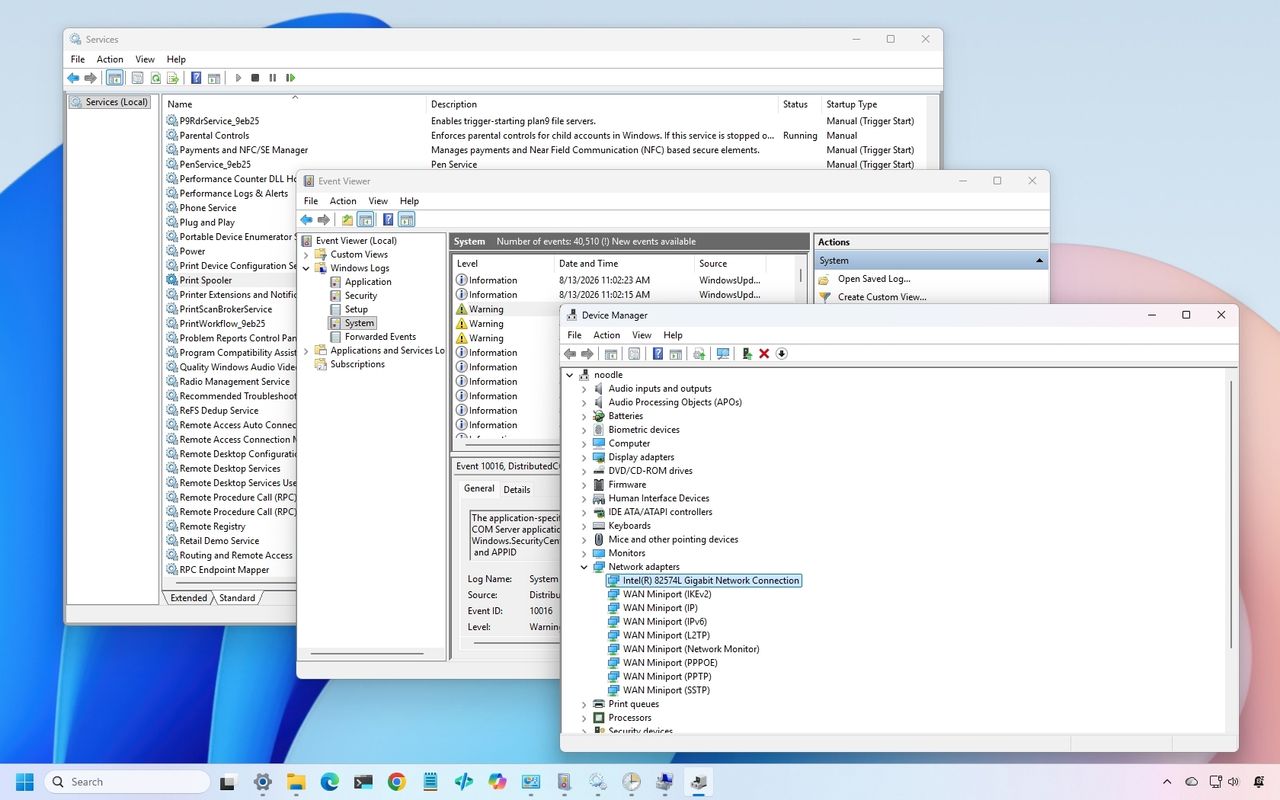
In particular, there are three classic tools I would like to see Microsoft modernize next, including Device Manager, Event Viewer, and Services.
And when the company eventually gets to work on these tools, I don't want "cheap" replacements that hide the advanced options. I want modern designs that preserve everything the existing tools can do while making them considerably easier to use.
In this guide, I'll highlight the legacy tools I want the company to update with a design that aligns with the style of Windows 11.
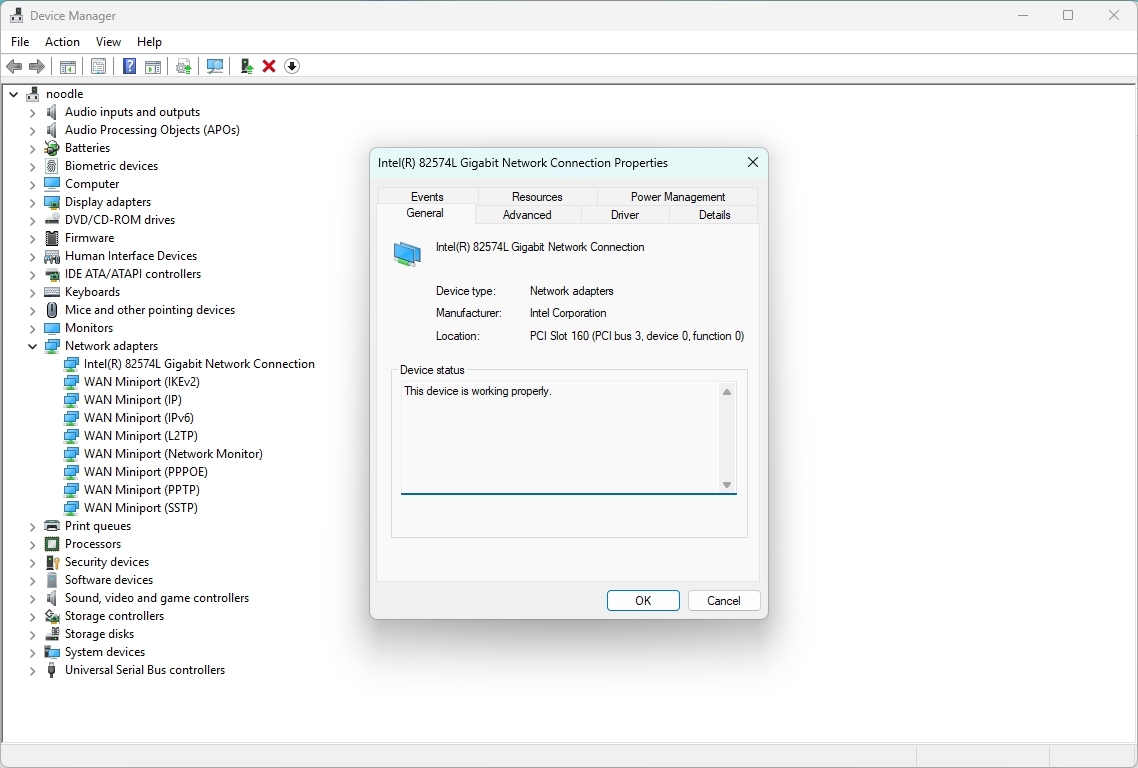
1. Device Manager
Device Manager is probably the most obvious place for Microsoft to continue.
It remains one of the first places I go when troubleshooting hardware or driver problems. Yet the experience has barely evolved compared with the rest of the system.
(Image credit: Mauro Huculak)
The basic workflow still revolves around expanding a tree of hardware categories, right-clicking a device, opening properties, and digging through a collection of tabs.
It works, but it doesn't feel like a modern tool a regular user would use. Microsoft could turn Device Manager into a much more useful hardware management experience without removing any of its existing capabilities.
I would like to see a modern hardware manager with a proper search box, better filtering, and a more useful device overview.
For example, selecting a graphics card could immediately show the device name and manufacturer, the current driver version and date, and the device state, in addition to options to roll back, uninstall the device, and enable controls.
The important part is that Microsoft shouldn't simply move the existing tree into a prettier WinUI 3 window.
It should rethink how the information is presented. If the system knows a device isn't working correctly, I shouldn't have to hunt through several tabs to find out. The interface should tell me.
Something as simple as a clear status indicator saying "This device is working normally" or "Windows detected a problem with this device" would make the tool considerably more approachable.
At the same time, the company should retain the advanced information that administrators and enthusiasts rely on.
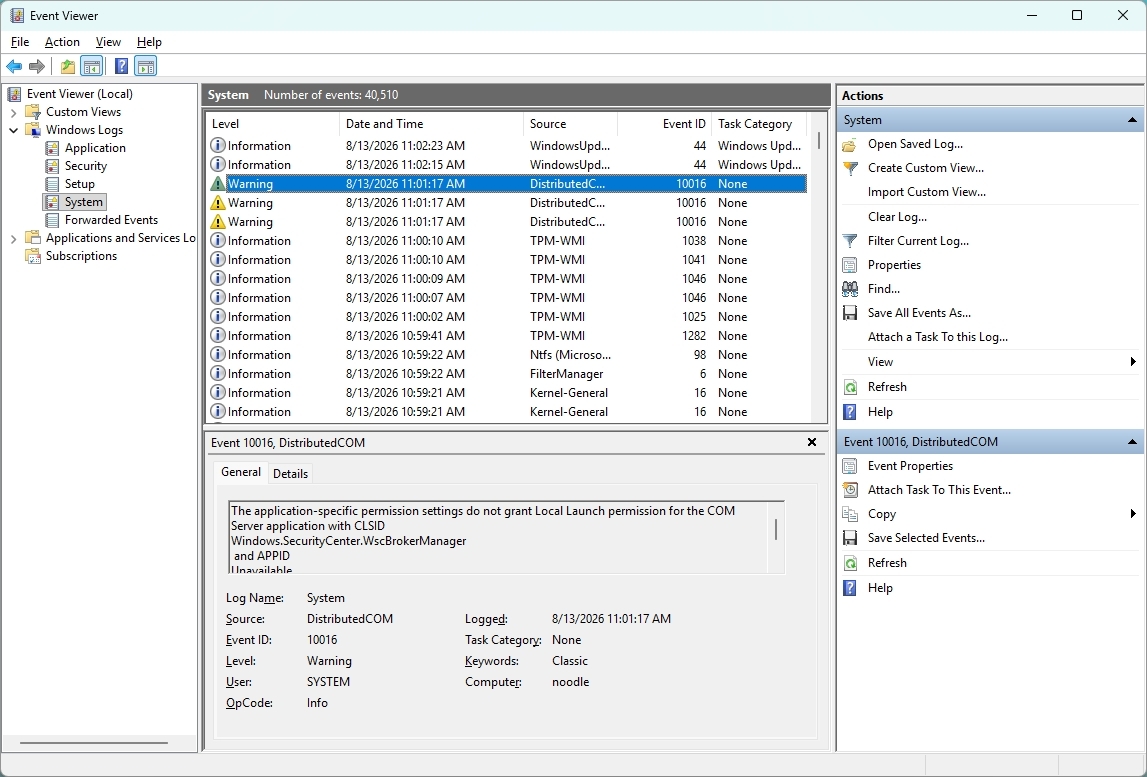
2. Event Viewer
Event Viewer is one of those tools that has plenty of useful information, but finding the information you actually need can be difficult, especially for someone who doesn't use the tool every day.
(Image credit: Mauro Huculak)
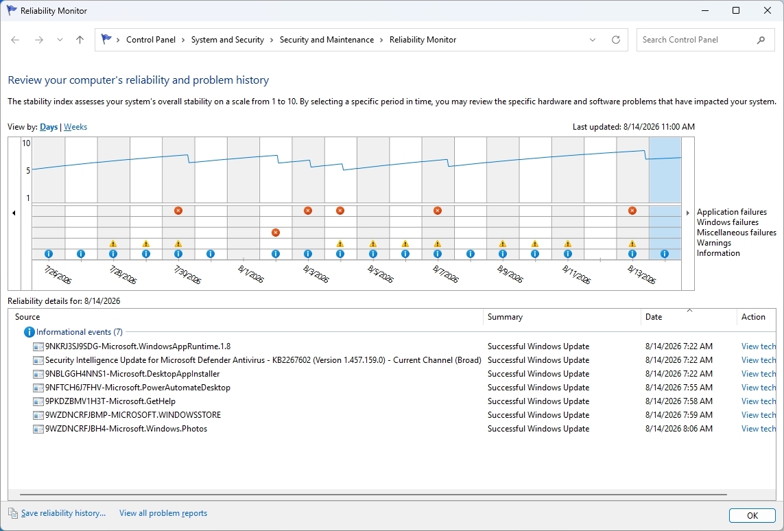
The bigger problem is that Microsoft already has a better way to understand system problems. Reliability Monitor. It gives you a timeline of crashes, warnings, and other problems, making it much easier to see when something went wrong. However, when you need more details, you're sent back to Event Viewer.
(Image credit: Mauro Huculak)
That's where I think Microsoft could do better. Instead of maintaining separate experiences, the company could combine the best parts of Reliability Monitor and Event Viewer into one modern troubleshooting tool.
For example, I should be able to see a timeline of Windows 11 and app problems, search and filter events, group related events, and quickly identify crashes, driver problems, and service failures.
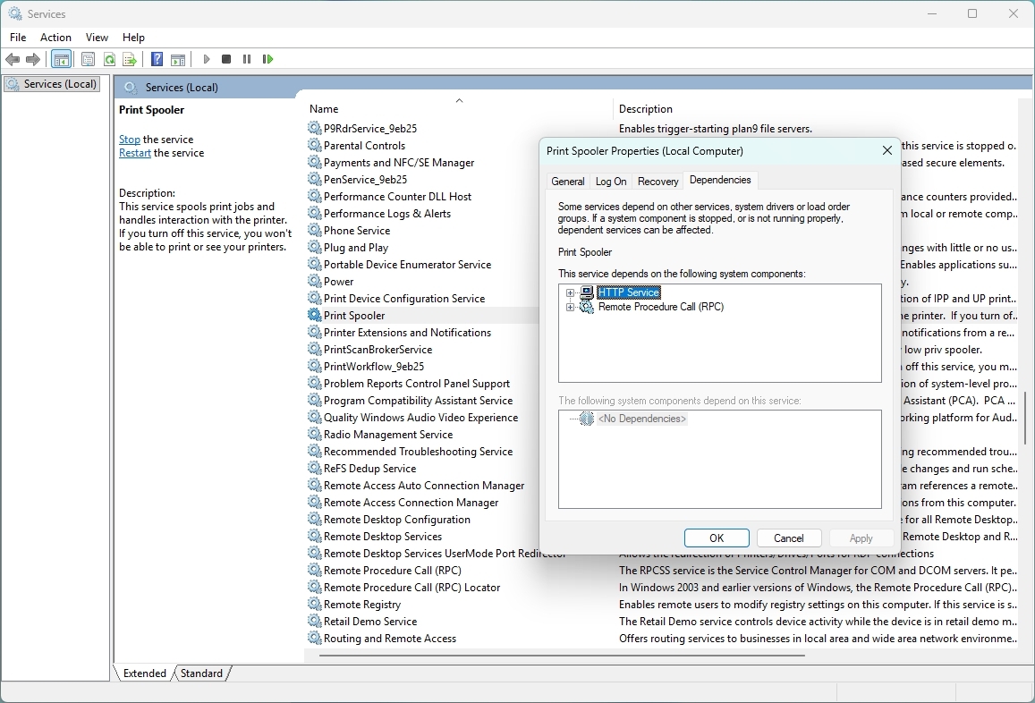
3. Services
The Services console is another tool I'd like the company to modernize, but not because it lacks information. The existing tool already gives you a lot.
(Image credit: Mauro Huculak)
In the Extended view, I can select a service and see its description, while the main list shows its status and startup type. Opening the properties gives me even more options, including dependencies, recovery settings, and the account used to run the service.
The problem is that the overall experience still feels like a management console from another era. For example, search could be one of the new features that should make it possible to search for Windows Update, Bluetooth, networking, or even an executable name and quickly find the related services.
Dependencies could also be easier to understand. The information is already there, but I have to open the properties and look through another tab to see it. A modern interface could show those relationships more clearly.
That would be especially useful when troubleshooting. If one service isn't working because another isn't running, Windows 11 could make that relationship clear instead of leaving me to figure it out myself.
I don't want the company to simplify Services by removing its advanced options. I want it to keep everything that's already there and make the tool easier to search, navigate, and understand.
And then there's Task Scheduler
Task Scheduler is another example in which Microsoft already has many of the pieces I would want in a modern tool.
The Create Basic Task wizard makes creating a simple task relatively straightforward. It walks you through the task's name and description, when it should run, what triggers it, and what action it should perform. The problem comes when you need to go beyond the basics.
The full Task Scheduler interface offers a large number of options across multiple tabs, making it difficult to understand how everything fits together. Triggers, actions, conditions, settings, history, and security options are all there, but the experience hasn't evolved much. And that's where I think Microsoft could make a difference.
In this case, I wouldn't want the company to change those advanced options. Instead, it could build a modern interface around them, making it easier to understand what a task does, why it runs, what it launches, and whether it's working correctly. All, while keeping the existing advanced configuration available when needed.
Again, the functionality isn't necessarily the problem. The experience is.
I'm fine with Microsoft moving Disk Management into the Settings app because it's already heading in that direction with Disks & volumes.
The same applies to Computer Management. I don't think the company needs to create a modern version of the entire console. A lot of the tools inside it already exist separately, including Device Manager, Services, Event Viewer, and Task Scheduler.
The parts that remain particularly useful, such as Shared Folders and Local Users and Groups, could eventually receive their own modern experiences. Or these could become part of the "Accounts" settings.
Microsoft doesn't need to reinvent these tools
I don't expect the software giant to rebuild every classic utility from scratch. I also don't think every legacy tool needs to disappear.
Some of these tools exist because the operating system has accumulated decades of functionality, compatibility requirements, and enterprise dependencies. Microsoft has already acknowledged that replacing deeply integrated components isn't as simple as building a new interface and deleting the old one because of functionality and compatibility.
That's why I like the direction Microsoft appears to be taking. The company recently indicated that it is looking to modernize the Registry Editor, one of the oldest and most recognizable administrative tools in the operating system. At the same time, the company has already been experimenting with a new Print Management app inside Windows 11 Insider builds, showing that some of these long-standing management experiences can be replaced with dedicated modern apps rather than simply being given a new coat of paint.
Microsoft doesn't need to modernize the operating system by throwing away everything that came before it. It can take the functionality people already depend on, put it behind a better interface, and gradually roll these experiences into Windows 11.
Device Manager, Event Viewer, and Services would be a very good place to start.
If the company can modernize those tools while preserving the advanced functionality that makes them useful, I'll take that over another visual refresh any day.
Which classic tool do you think Microsoft should modernize next, and what would you change about it? Let me know in the comments.
More resources
Explore more in-depth how-to guides, troubleshooting advice, and essential tips to get the most out of Windows 11 and 10. Start browsing here:
Windows 11 has a major update on the way, and that update promises to address some of the loudest complaints about the operating system. August is traditionally a slow month for Windows news, but thanks to some previews of what’s on the way next month, we have a lot to talk about.
Microsoft’s refreshed taskbar, customizable Start menu, and other improvements are all in the final stages of testing. Microsoft confirmed that a major Windows update is on the way very soon. But my question is, should that major update have been Windows 12?
Biggest News of the Week
It’s worth asking what a new operating system even is in 2026. As opposed to historical upgrades, the kernel and underlying code base of Windows stays largely the same when jumping between major version numbers. We’re well past the days of major architectural changes or code based swaps that make old software incompatible, at least when it comes to computers.
Is a new Start menu or a revamped taskbar set of options enough to justify calling a new OS Windows 12? Perhaps a revamped Settings app or an upgraded core experience for connecting your phone to your PC is enough to do it. There’s a fine line between a UI overhaul and a fresh coat of paint when it comes to making a new operating system.
Is the Damage Already Done?
The core question about keeping the Windows 11 name or upgrading to Windows 12 is if the damage has already been done or, in other words, is it even possible to save Windows 11 in the eyes of the public?
Windows 11 launched in controversy. The minimum requirements of the operating system made millions of PCs ineligible for an upgrade. Other decisions from Microsoft, such as rebuilding the taskbar without all of the options available in previous versions of Windows, also drew criticism.
I’m among the critics of Windows 11. I’ve pointed out several of the flaws in the operating system and mistakes I feel Microsoft has made. But I’m also a newswriter for a niche website that focuses on Windows. The general public may not be so passionate.
If Windows 11 is a lost cause, Microsoft should gather together a bunch of the changes from the Windows K2 initiative and package them into Windows 12.
Learning the Right Lessons
The Lenovo Slim 7X and many other PCs are great regardless of if they are Copilot+ PCs. (Image credit: Future)
If there ever is a Windows 12, I’m worried that Microsoft would have it focused on the wrong things. One of my favorite podcasts often says Hollywood learns the wrong lessons when a movie makes money. I think that could be the case with Windows 12.
Microsoft is trying to be better with Windows 11 and its K2 initiative shows promising signs, but part of me still worries that the higher-ups of Microsoft will think AI PCs are the future and use the sales of Copilot+ PCs to justify a Windows 12 centered around artificial intelligence.
But it’s not that Copilot+ PCs are must-have devices and that consumers are running into stores to find PCs capable of running AI. If you make the models of the best-selling PCs Copilot+ PCs and then those computers continue to sell, that’s not a sign that people want Copilot+ PCs. If you cram AI into every computer on the market, you can’t then justify making Windows 12 AI-focused by saying every PC is AI capable.
A hypothetical Windows 12 should be about moving past the stains that cover Windows 11. It will have been long enough since people bought new PCs that the TPM 2.0 requirement will not be as big of a deal. Additionally, Microsoft will have fixed the major user interface issues that have drawn so many complaints over the years.
Shopping with Sean
My top pick for shoppers this week is the XPS 14 (2025). That laptop is still on sale and is still one of the best bargains available. I love the XPS 14's design and a $1,150 discount on a PC with 32GB of RAM is rare these days.
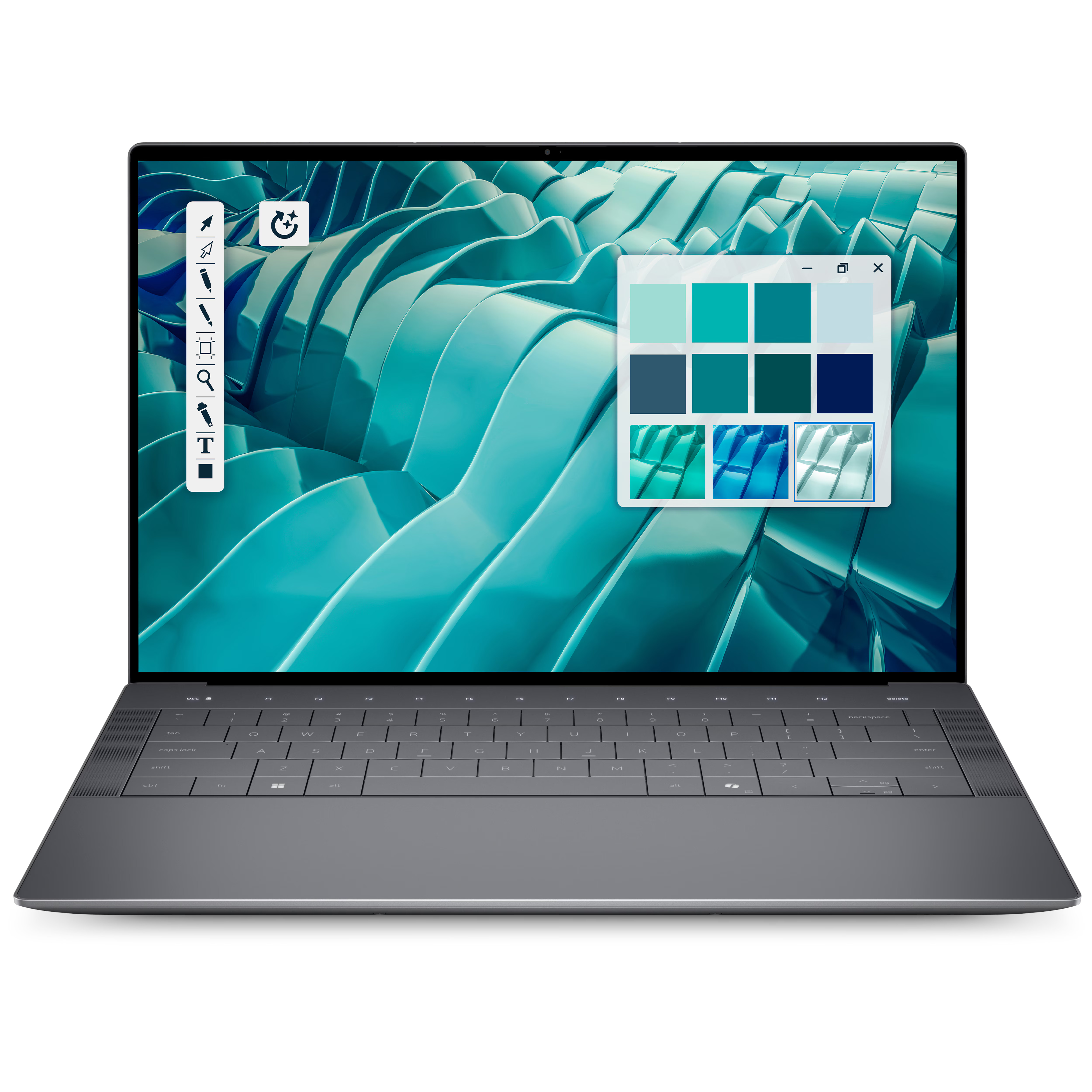
This premium laptop has a 3.2K OLED touch display, 32GB of RAM, and a gorgeous design that takes advantage of every millimeter available. It's one year old, but it's still an excellent laptop in 2026.
Note that the review of this laptop was from before the Dell 14 Premium was rebranded to the Dell XPS 14.
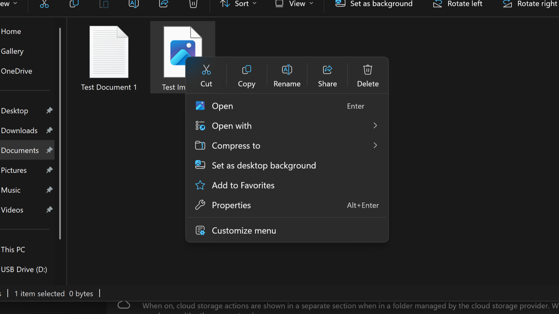
Last month, I revealed that Microsoft was hard at work on a redesigned context menu system for Windows 11 that's designed to make them faster and more customizable. Now, we've got our first look at the new context menu customization features, discovered hidden in the latest Windows 11 preview builds, and I've been trying them out!
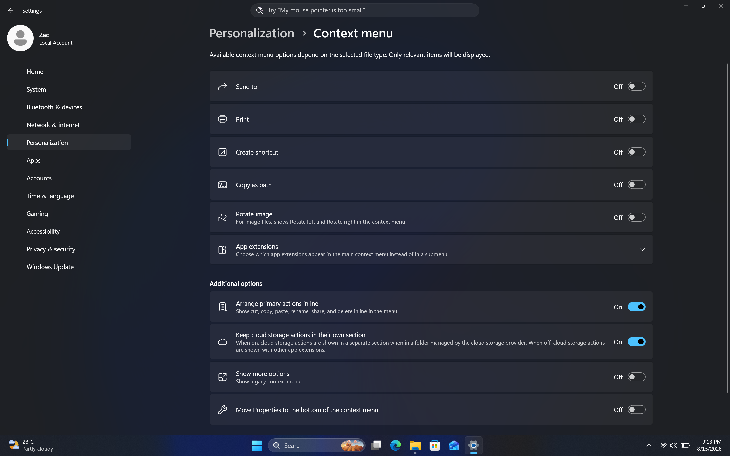
Soon, you'll see a new customize menu option appear at the bottom of the context menu. When selected, you'll be taken into the Windows Settings app where you'll see a wide array of new options that allow you to configure the layout and actions that appear within the context menu.
The toggleable actions presented to the user are:
Send to
Prin
Create shortcut
Copy as path
Rotate image
App extensions
Arrange primary actions inline
Keep cloud storage actions in their own section
These options allow users to hide certain actions that they might not often use, speeding up the context menu in the process. Additionally, Microsoft is adding an option that lets you change how actions like cut, copy, and paste appear within the menu.
By default, these primary actions appear at the top of the menu in a horizontal layout. This new option will let users restore how they used to appear on Windows 10 and older, where they are listed vertically alongside the other actions within the menu.
It's also worth noting that by default, the context menu has most actions disabled automatically. That means the context menu will be fast for users automatically when these changes roll out, and you'll have to head into the customization options to add back any actions you find useful.
The new customization options for the context menu are quite in-depth.Windows CentralThis is the new default layout for context menus.Windows CentralAnd here's what it looks like when you set primary actions to appear vertically. Just like old times!Windows Central
These new customization options are really great to see, and show that Microsoft is finally listening to feedback when it comes to common UI surface such as the context menu.
The legacy Windows context menu is also still present, and while it no longer appears as an option in the context menu by default, you can still go in and enable that action if that's something you find yourself using. Notably, there's still no option to set the legacy context menu to be the default experience.
In the meantime, we know the new customizable context menu options are imminent, with an announcement from Microsoft expected in the next week or two.
Thanks to phantomofearth for discovering and helping me enable the feature to try out!
Join us on Reddit at r/WindowsCentral to share your insights and discuss our latest news, reviews, and more.

 Connexion